FOR
99 Bikes
TYPE
Logo Design
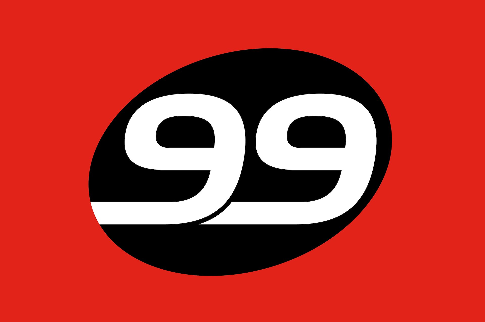
Just before I left for France back in 2007 I was approached to design a logo for Skroo Turner’s son, Matt, and his new chain of Bike stores, 99 Bikes.
The 99 in the icon was designed to look like the handle bars of a racing bike, and the slanted angle of the icon and type was to indicate speed and movement.
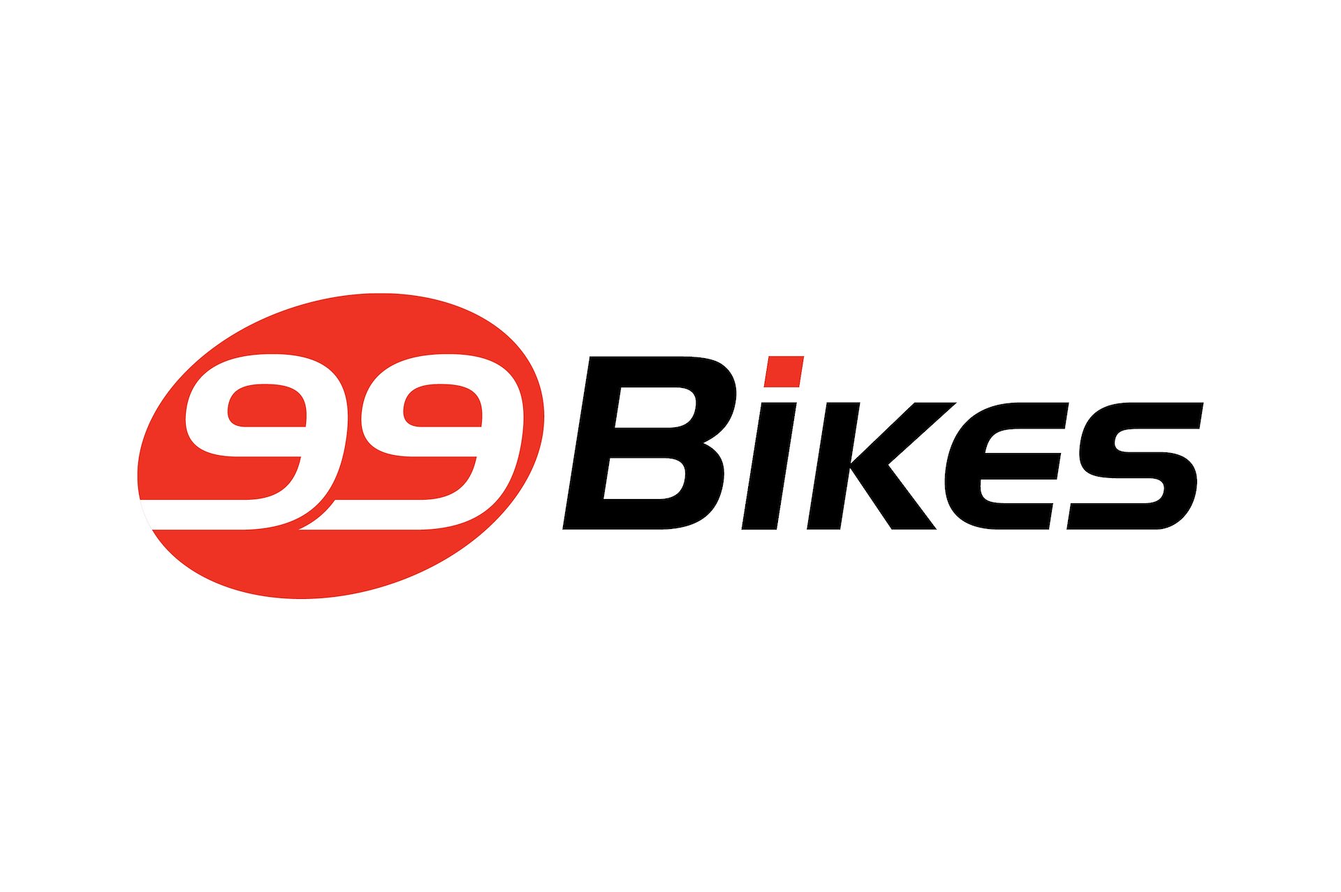
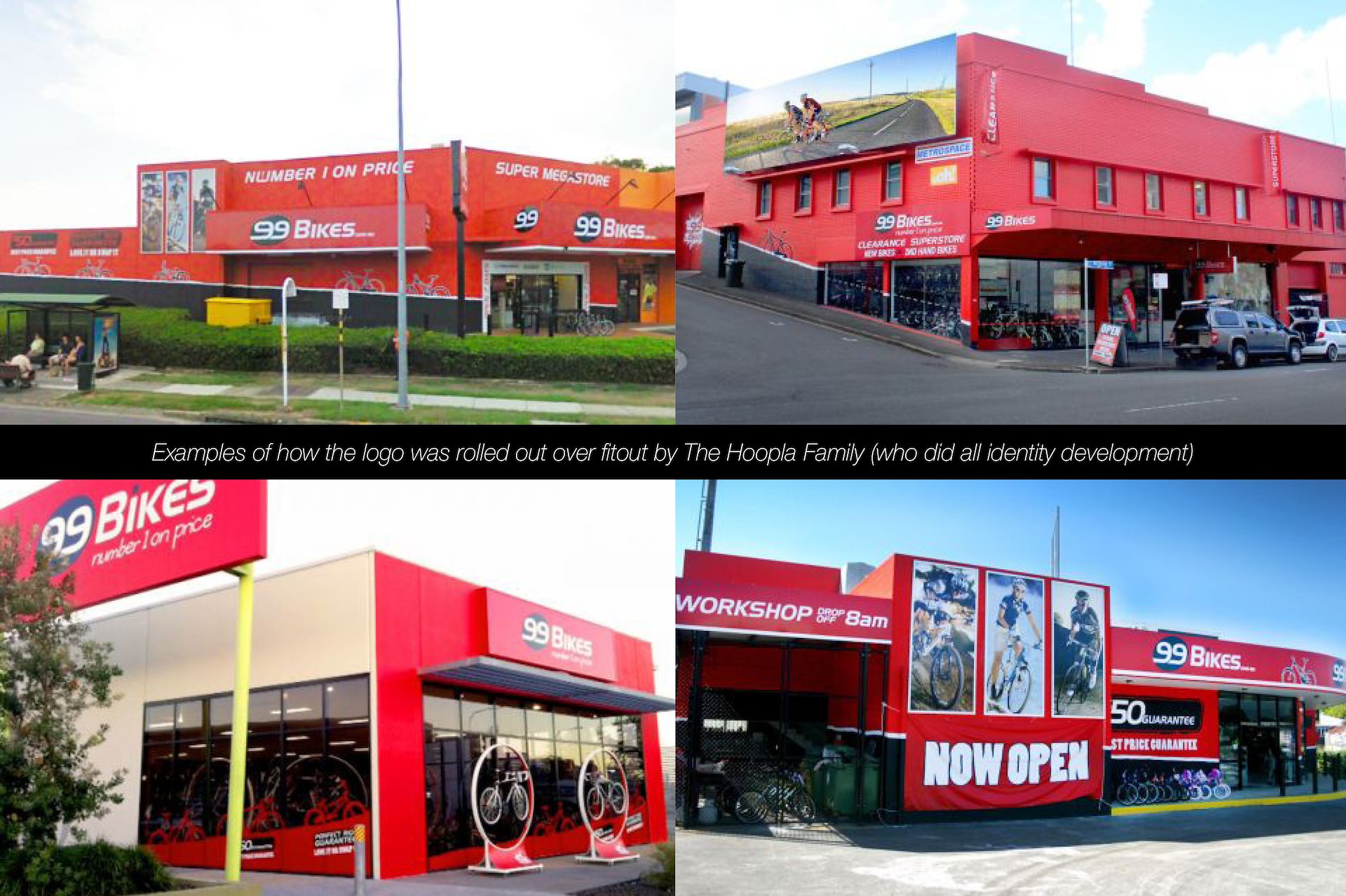
The talented folk over at The Hoopla Family took over the project and did an amazing job at developing a really striking identity for the brand, which worked well over all aspects of the marketing collateral. In the years since, this branding has changed and evolved, but the logo has remained the same for 15 years.
99 Bikes is now one of the most recognisable chains of cycle stores nationally, and it all started here.