Setting the scene
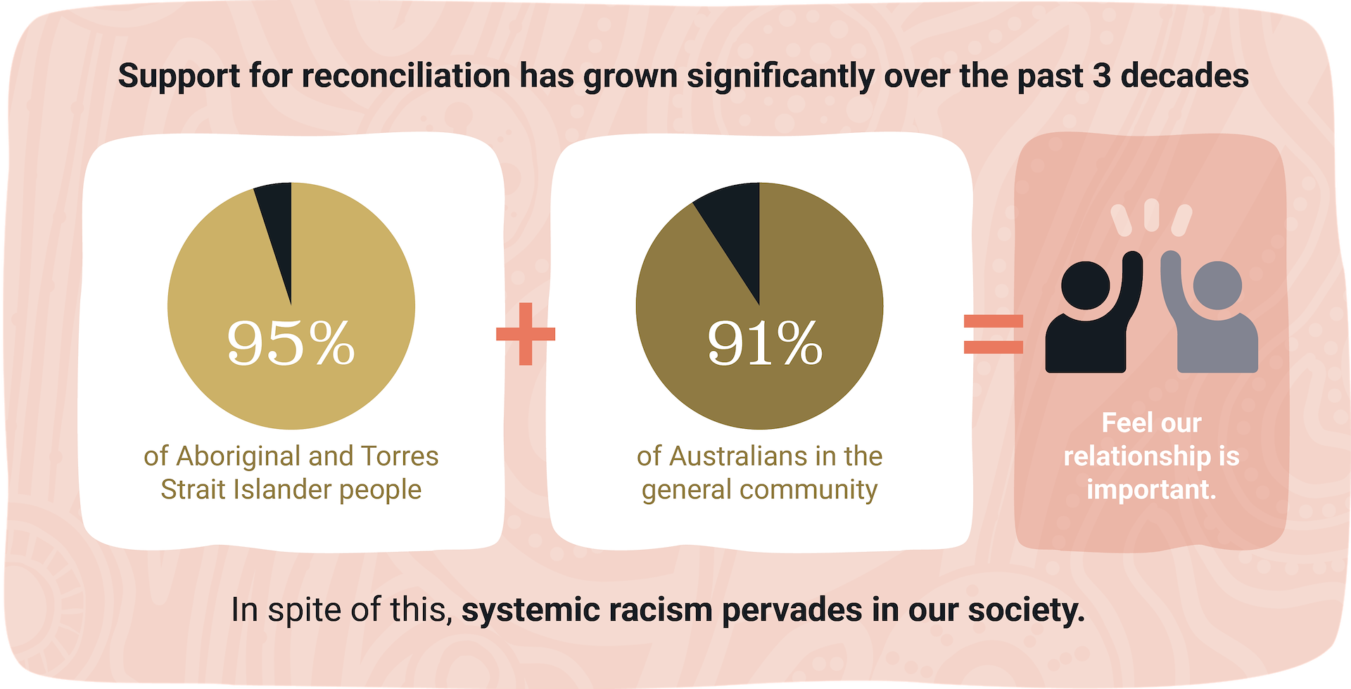
Australia has the oldest living continuing culture in the world – at least 60,000 years and counting. It is a culture Australia should be proud of, value and seek to understand.
However, in the 250 short years of European settlement, First Nations Peoples have been systematically dispossessed of their land, their culture and their self-determination.
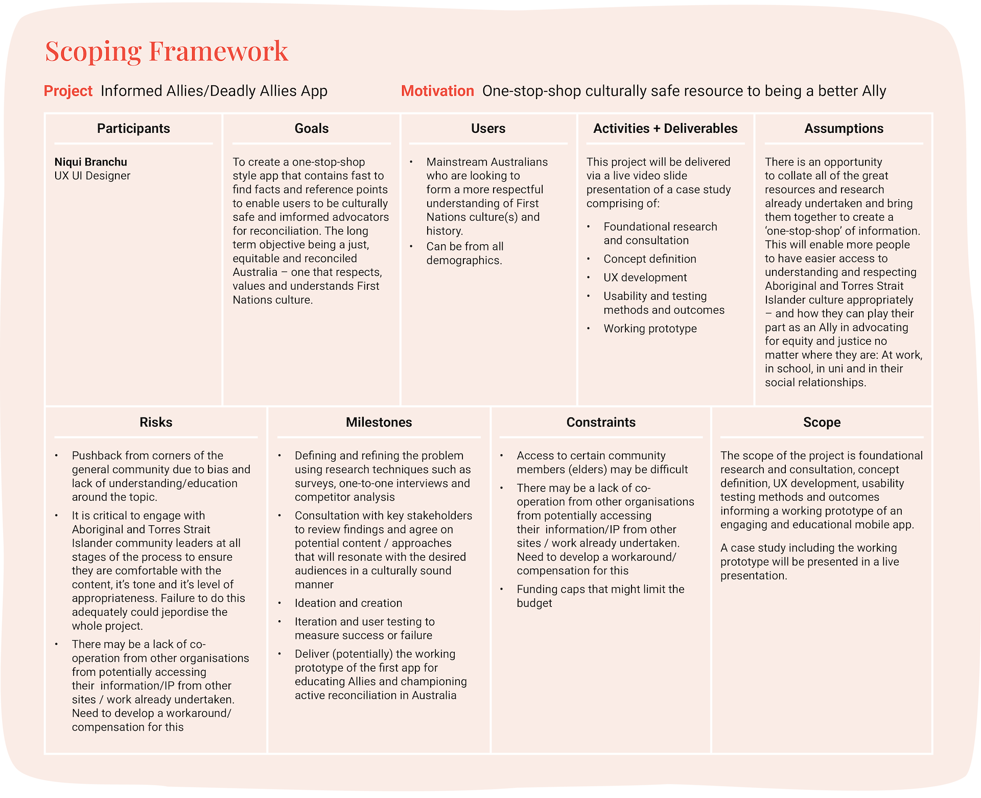
Project scoping
Given that racism is a consequence of ignorance, my idea was to try to give access to more educative resources on First Nations Australians to mainstream Australians. I developed a scoping framework to get a birds eye view of the objectives and scope of the project. They communicate deliverables and outcomes as well as identifying potential risks and how these might be mitigated.
Problem statement
Many mainstream Australians in the general community want to have an appropriate connection to, and meaningful understanding of, First Nations culture but are unsure how to go about it in a manner that is culturally safe.
Research plan
To collate the best types of responses from the target audience I identified the following research techniques as the most appropriate for the problem space.
Survey
21 participants
Surveyed a broad cross-section of potential users from different backgrounds
Tested for general knowledge in the problem space to form a baseline
Tested for the desire for knowledge and resources in the problem space
One-on-one interview
3 x 30 minute interviews
Selected three different types of user – a corporate exec, someone working in the First Nations community and a mother of two.
- Conducted deep dive into thoughts, feelings and needs in problem space
Competitor analysis
No product to benchmark so I …
Conducted a review of the status quo
Investigate how it’s being managed by other organisations
Reviewed resources currently available
Identified their pros and cons
- Identified where the opportunities lay
Contact
- email@domain.com
Survey insights
Responses revealed:
71.4% of users didn’t learn about First Nations culture in school
85.7% of users were interested in learning more about First Nations culture
26.3% of users found it difficult to access information on First Nations culture
Interview insights
In general users:
• Wanted to learn more about First Nations history and culture
• Worried about causing offence with their ignorance of protocols
• Wanted to know they were looking in the right place for cultural information
• Wanted to know which First Nations businesses are legitimate (First Nations owned and operated) so they don’t support non-First Nations operators imposters
• Felt that a one-stop resource covering off on this information would be ideal.
Competitor insights
• There were some great resources online, but they were scattered around and you had to have a bit of ‘insider knowledge’ to know what to look for
• There was no ‘one stop shop’ that covered off on everything in one place that was easily digestible by everyday Australians
• The new AIATSIS website is great but not many people know about it as a place to start
• Reconciliation Australia was great but there is so much information its a bit overwhelming, especially if you haven’t been exposed to this space before.
Synth the research
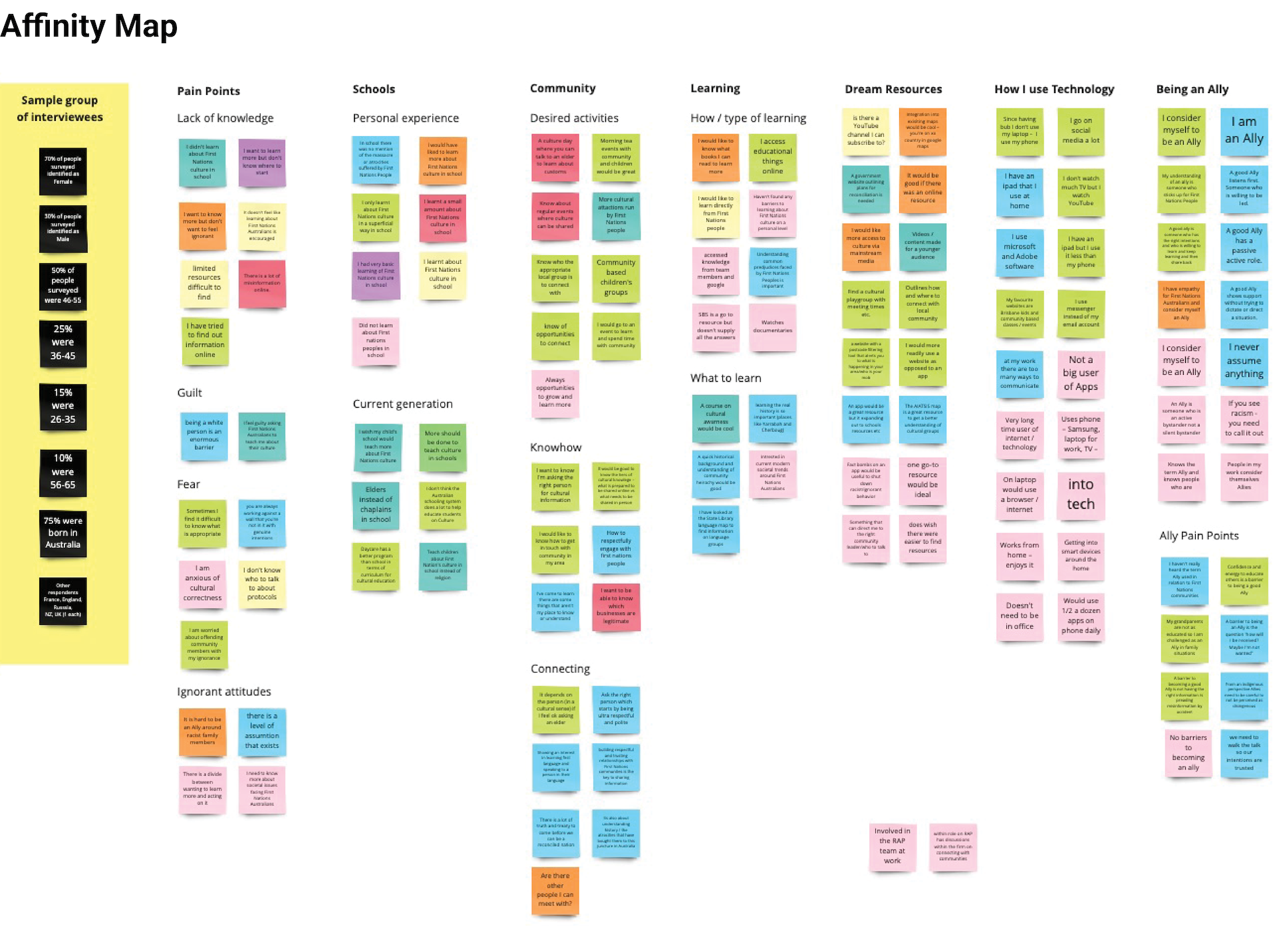
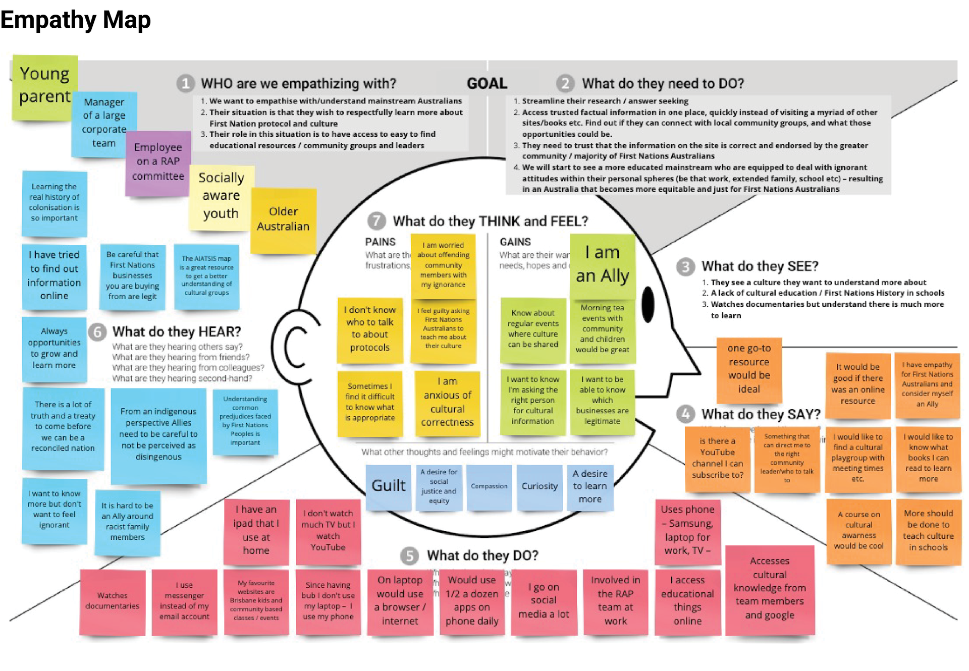
I created an Affinity Map to sort the large amounts of data that I extracted from my interviews. There were a number of key themes and patterns that emerged that helped me to start determining user requirements. Once I had completed the Affinity Map, I then used those findings to create an Empathy Map. This helped me to further synthesise my results from a human centred perspective and start to build a picture of who our user might be.
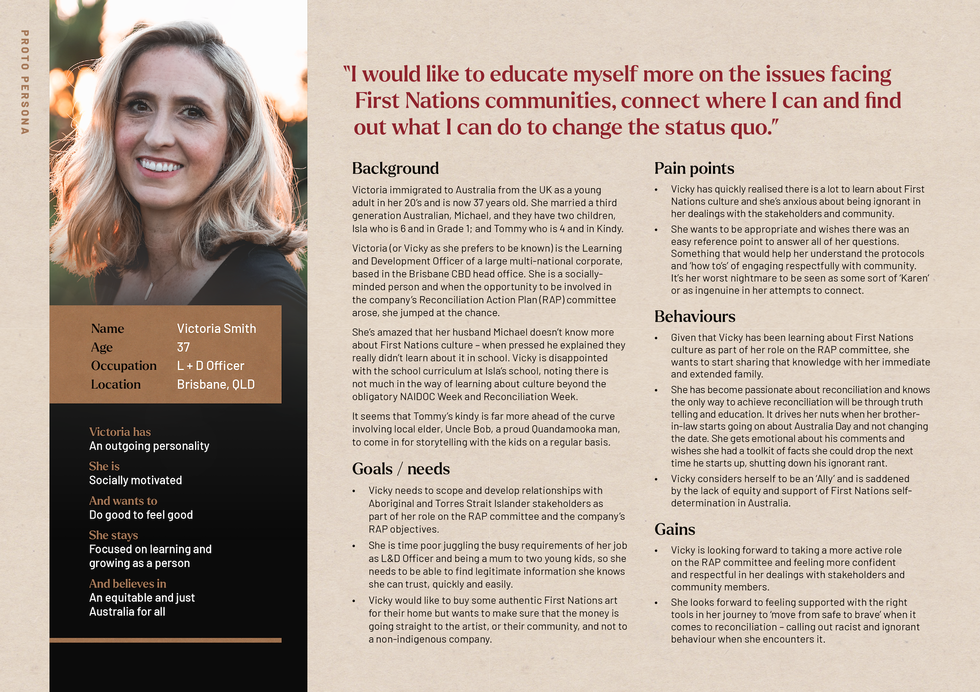
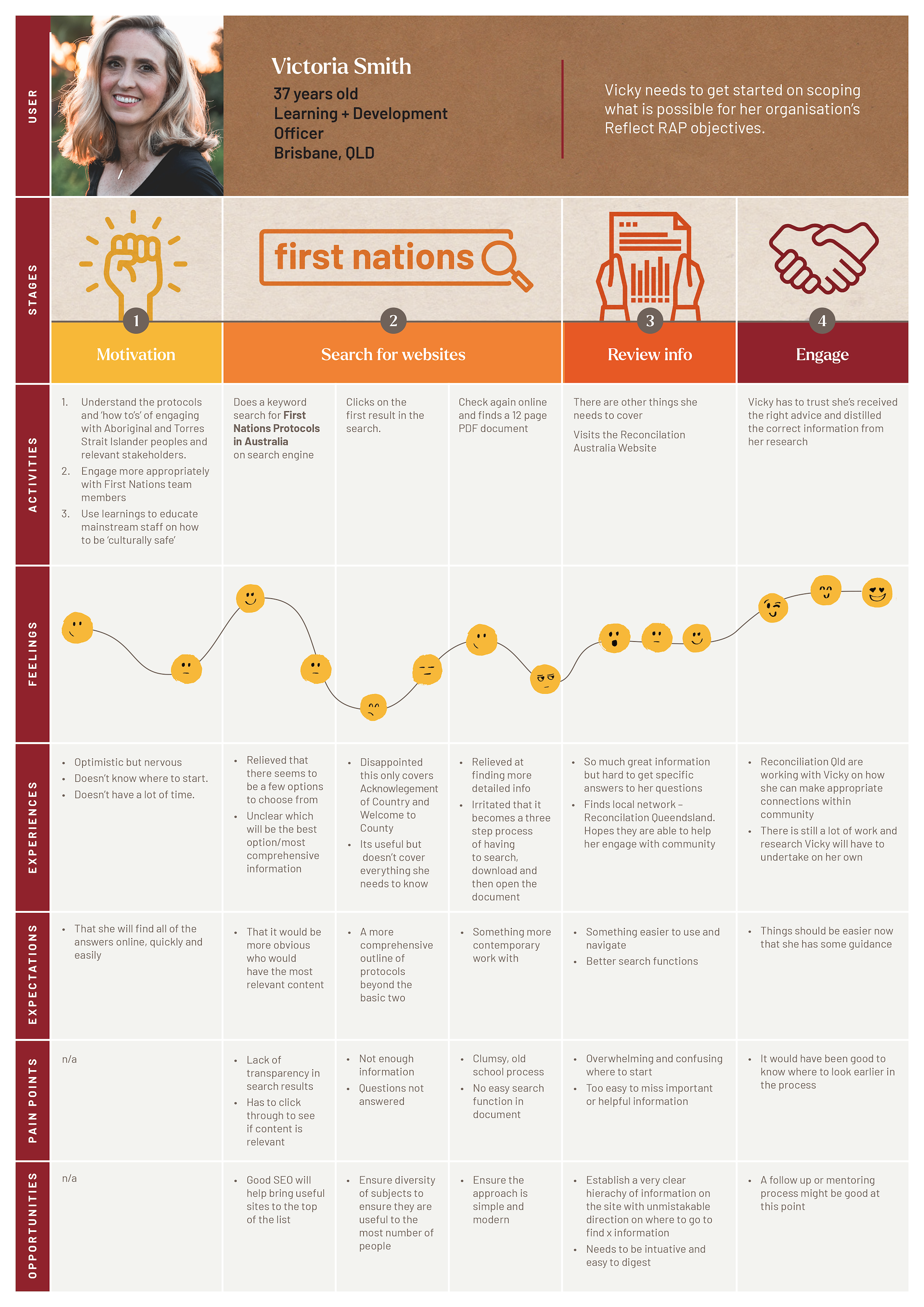
Who is the user?
I defined a personality “type” drawn from the Empathy map I created. This formed the basis for my Persona. ‘Vicky’ is representative of the primary user group (workers in a corporate environment) based on her motivations, key behaviours and mindset as well as her goals, needs, pain points and influences behind her behaviours. Having a persona will help me look at product decisions based on how Vicky would respond, not how I personally would – eliminating the risk of personal bias.
Vicky's journey
I developed a Journey Map for this persona to get an overview of Vicky’s user experience over a specific timeline. I observed different interactions and experiences, and noted pain points and opportunities throughout the process. This helped me identify trends and patterns to take forward into the next phase.
How might we?
Looking to the challenges faced by our user in the Journey Map, and looking back to the research I’ve already undertaken, I can now look forward and investigate ways that navigate the difficulties and make the user’s job easier. Turning problems into opportunities.
The HMW I took into ideation was:
"How might we give users access to information on First Nations culture and protocols so that they are better equipped and educated in their dealings with community?"
Ideation
My ideation processes involved some colleagues in a brain writing exercise to help me flesh out the structure and types of content that could be included in my product. I also did some Crazy 8’s and a storyboard to really help bring the concept to life.
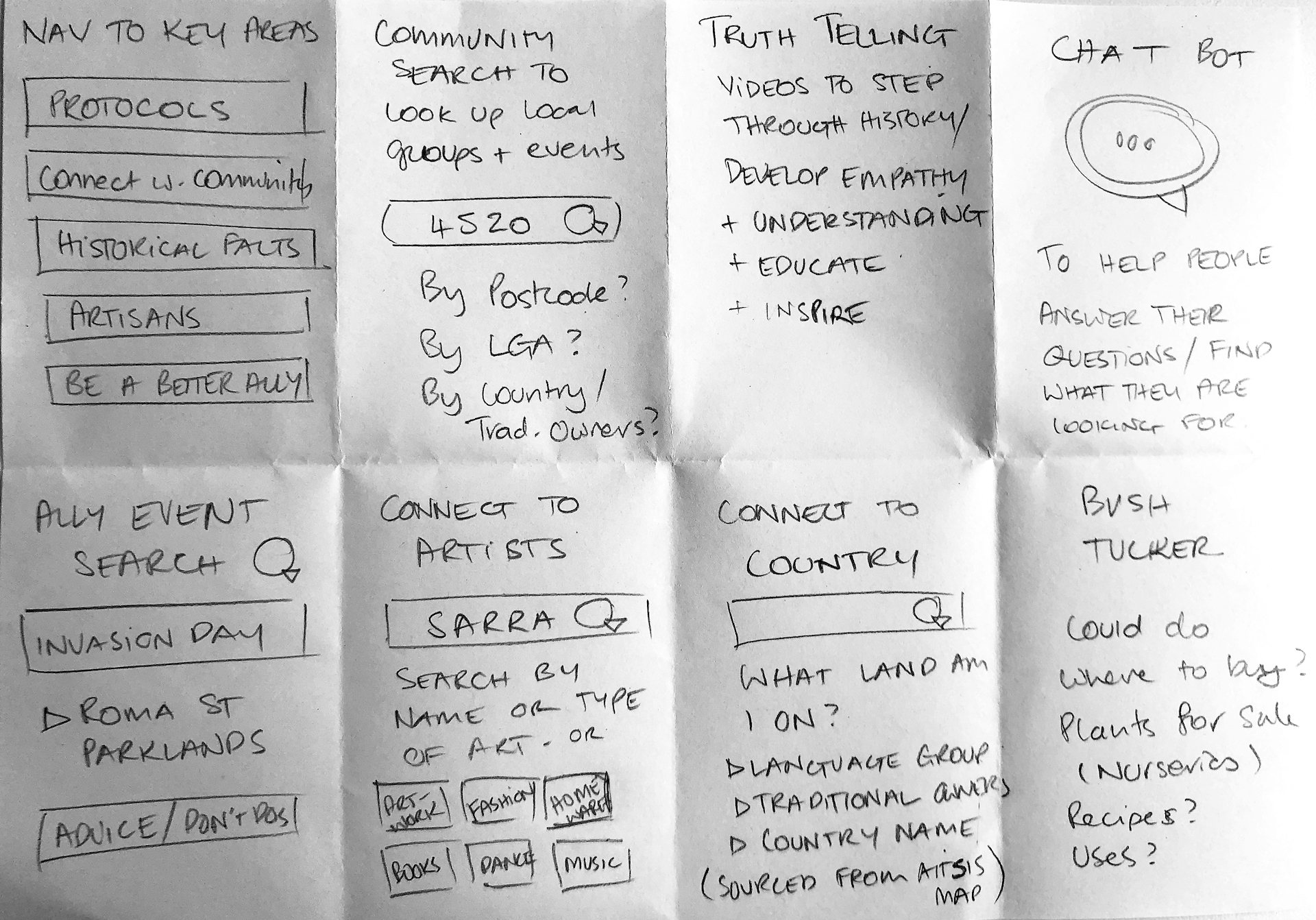
Crazy 8's – some of these ideas made it to the final prototype
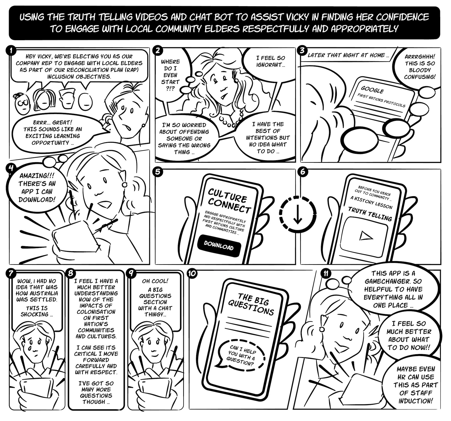
A storyboard (using my own illustrations) to outline a potential user journey Vicky might take.
Information architecture
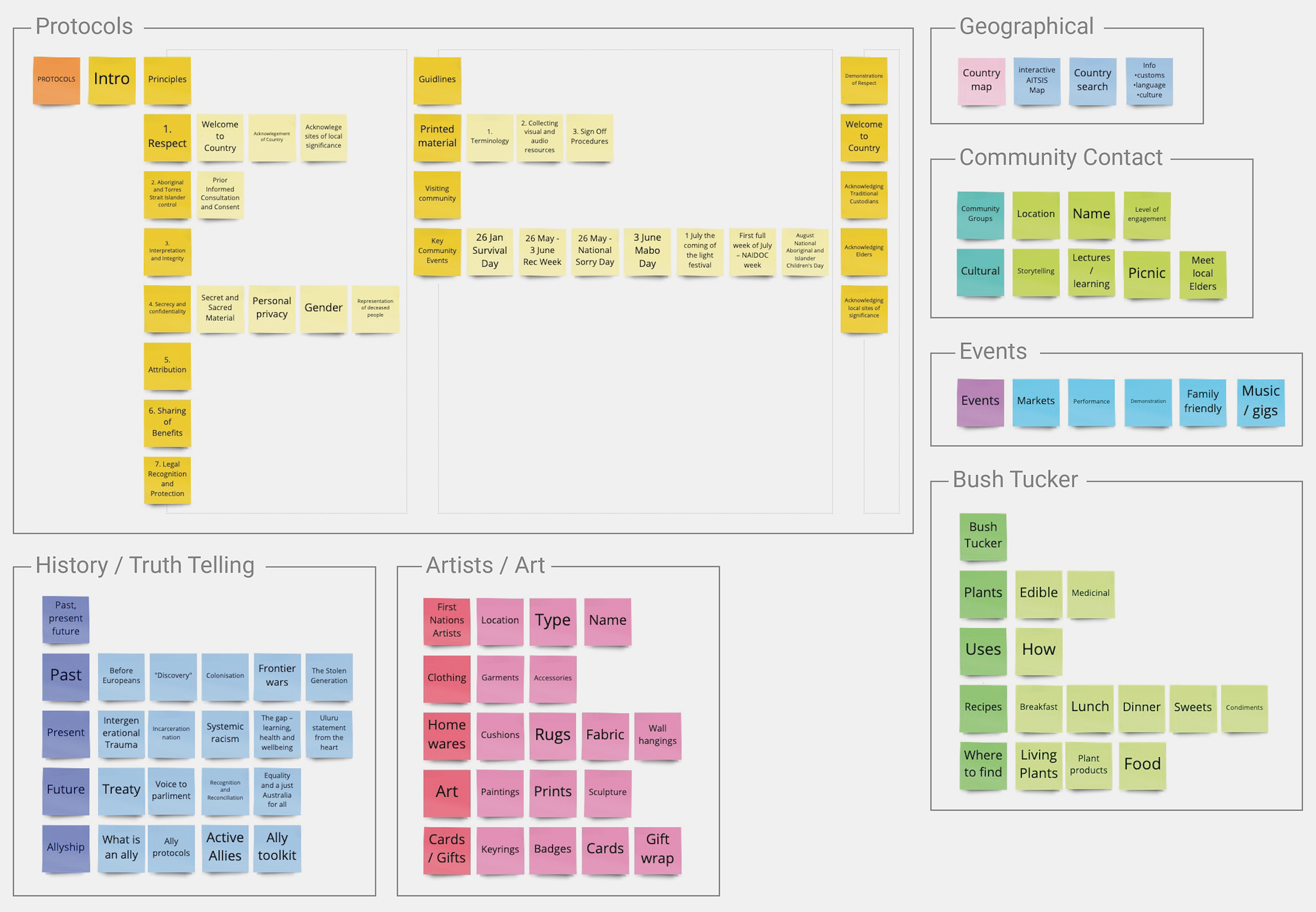
I used card sorting to help me identify important topics and group them by similarity into categories. This revealed the mental models that will inform the IA and user facing navigation.
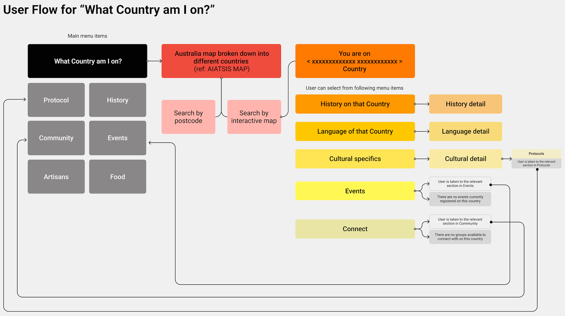
Next I generated a user flow to show how Vicky would find out what First Nations country she was on. She can discover the traditional owner group of the land she was currently on and learn more about them. She can find out about their history in that area, their language, make connections with local community groups as well as find out what events are taking place.
Sketches and lo-fi wires
After completing my user flow I sketched it out. The intent was to work quickly so I could peg out ideas and experiment freely – just focusing on the flow and purpose of the user journey for this flow.
I then created a series of low fidelity wireframes in Balsamiq to take it to the next level of iteration and refinement.
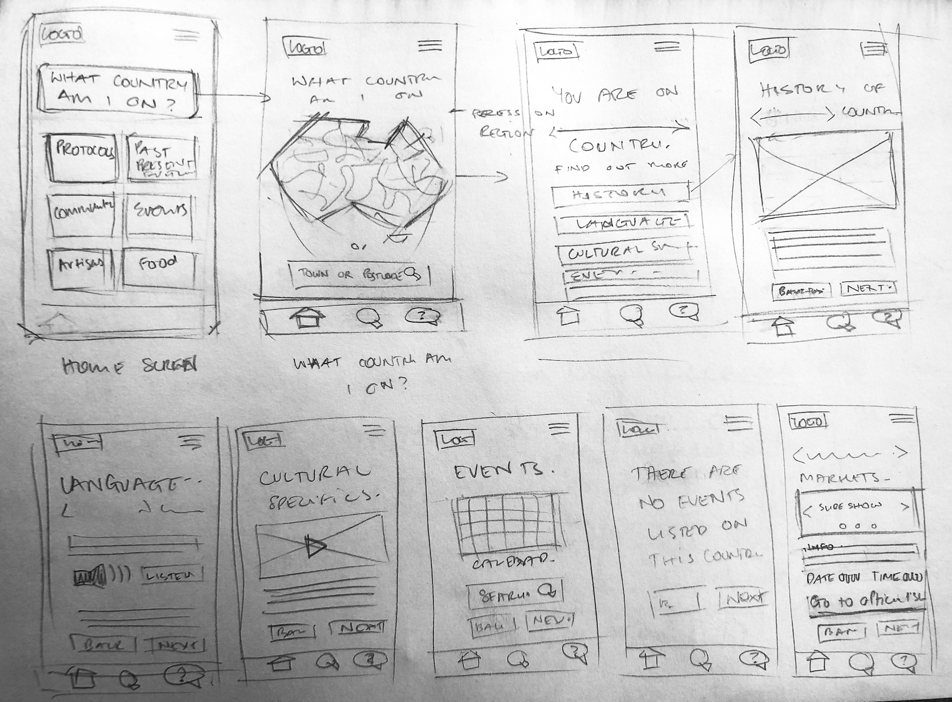
Initial sketches
Lo-fi wires
The artwork used
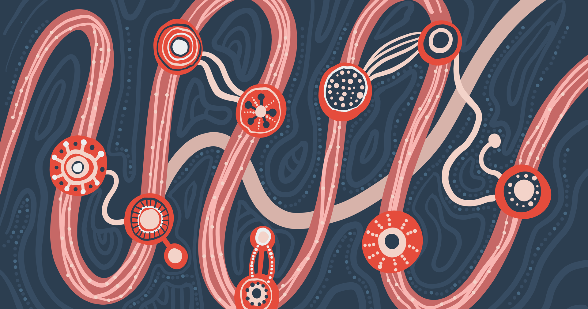
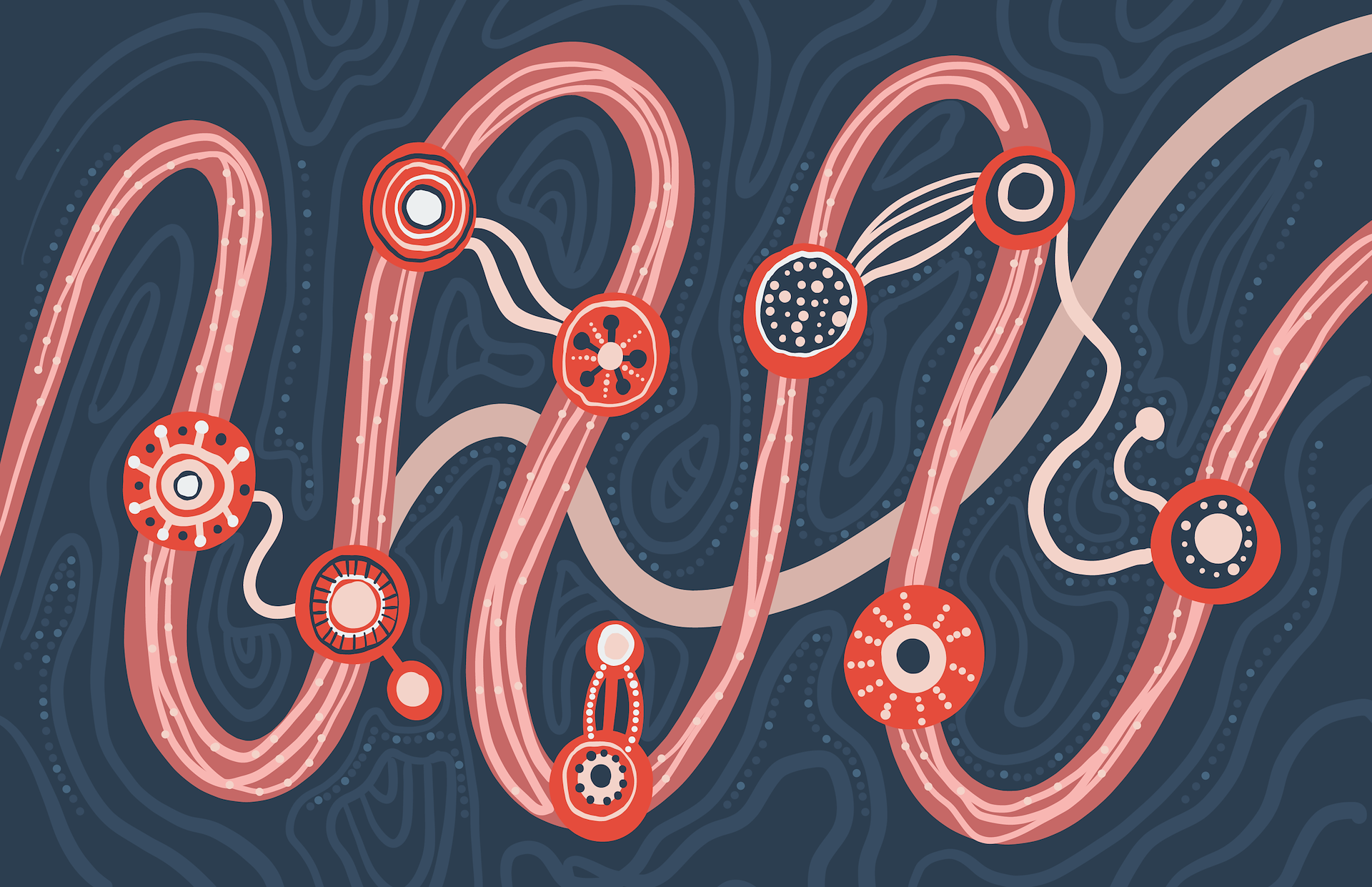
A number of years ago, I was very lucky to have an original artwork created for me by Goreng Goreng artist Rachael Sarra. This artwork represents the story of my life which was portrayed as a learning story. As this product is all about learning, the stories aligned. I approached Rachael and she gave her permission for me to use her artwork in this project. If this were a real world project a new artwork would have to be commissioned with a specific story that speaks directly to the product.
The visual identity
Because this is a new product with no precedent, I had to create a brand identity to apply to the app. This included a logo, brand elements, type system, colour palette and image selections/treatment. This identity was then taken into Figma and type scales, styles and components were created to facilitate a consistent application of the branding.
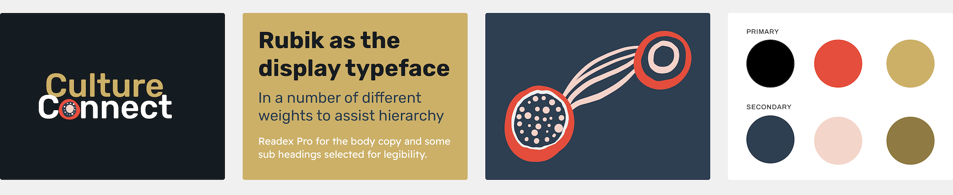
The logo
The logo was created using the Rubik font, combined with an element lifted from the artwork. It represents the emergence of First Nations culture in main-stream Australia.
Type system
- Rubik was selected as the display font as it is approachable and easy to read. Readex Pro was a good pair for the display font and it’s geometric forms make it easy to read at smaller sizes.
Design elements
- Certain elements were lifted from the master artwork to use sparingly to add interest throughout the app.
Colour palette
- The colour palette for my product was derived from the master artwork however I made some additions to ensure it would meet accessibility requirements.
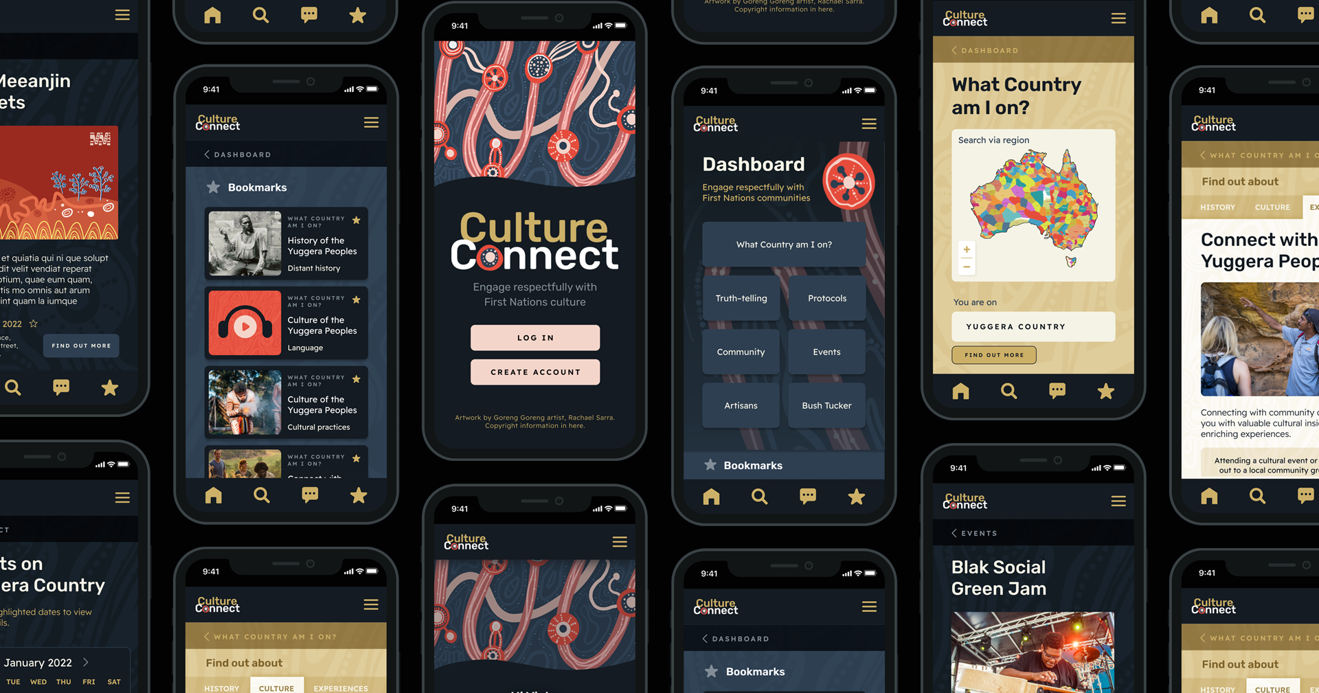
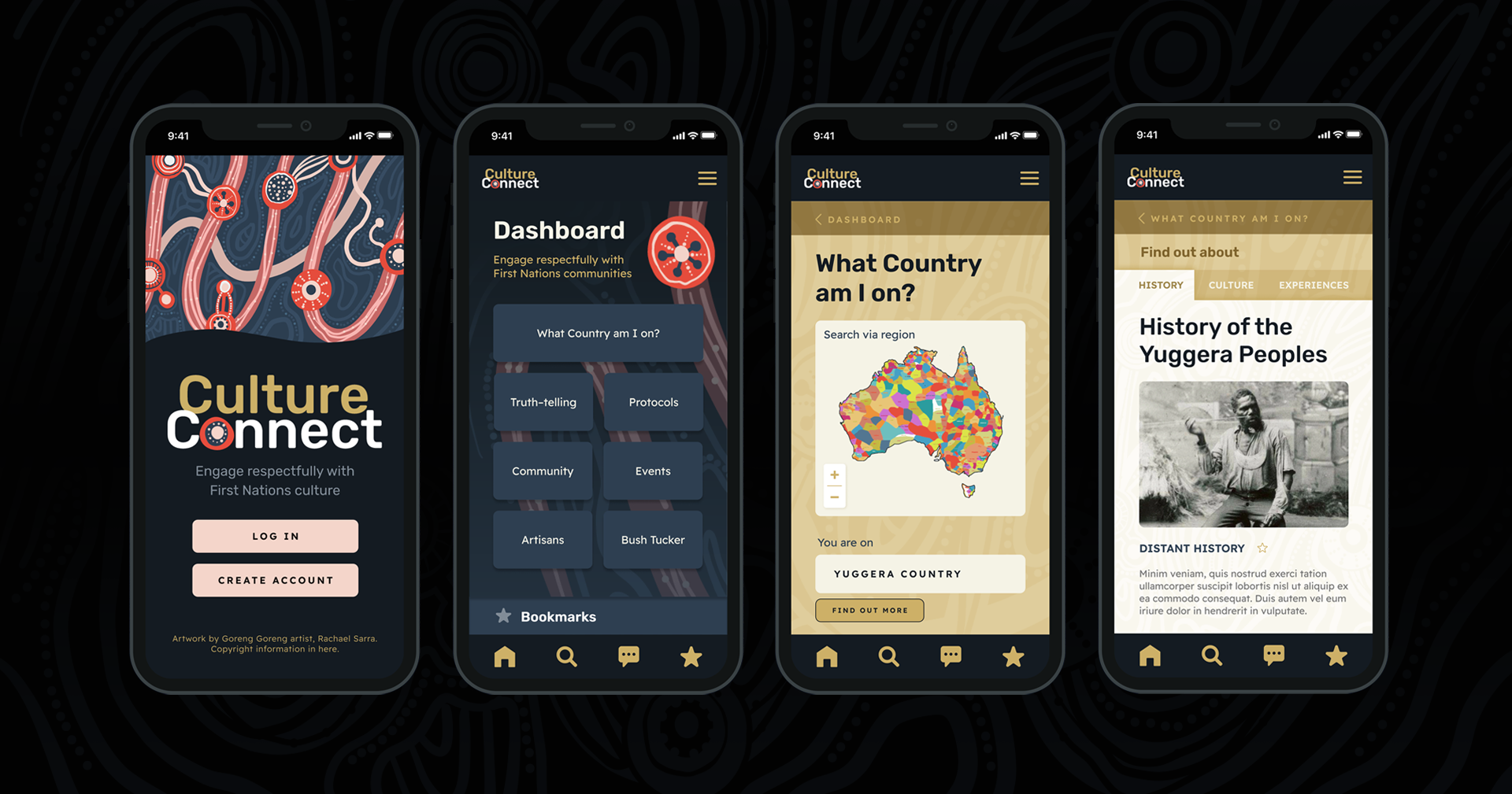
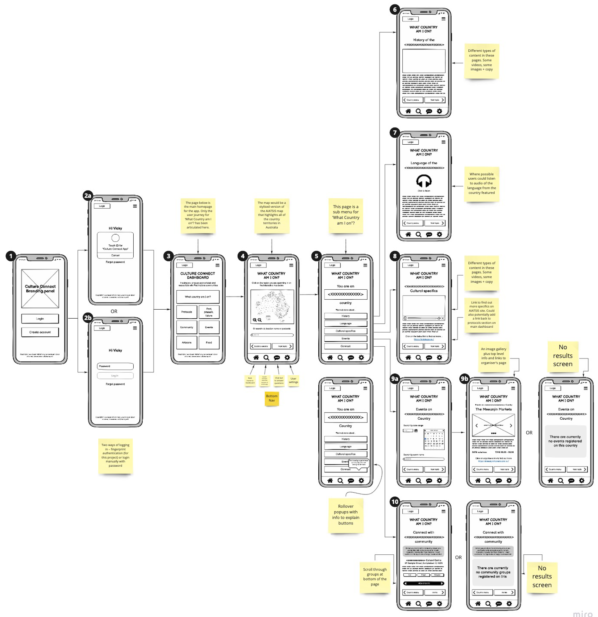
Hi-fi prototype
Drive it like you stole it! I’ve embedded the high fidelity clickable prototype below.
Please note that this was an assessment project. As such we only built out one user flow and that is the flow for 'What Country am I on?"
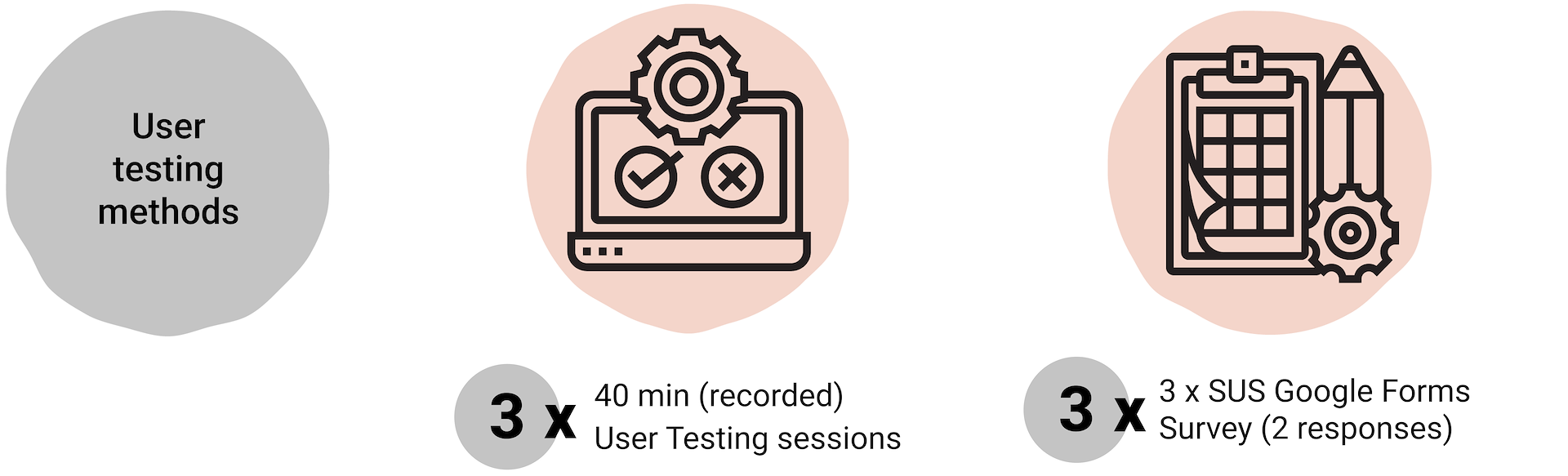
User testing
The user testing revealed:
Overall the users found the app easy to use, easy to navigate and easy to understand.
There were some questions raised by one participant over the hierarchy of the buttons on the Dashboard. Specifically, the ‘What Country am I on?’ button dominated and looked like it was the parent button to all of the others on the Dashboard.
In this instance I chose to leave things as they were because initial testing suggested that finding out ‘What Country am I on?’ rated more highly in terms of interesting subjects. However, it was good feedback that I would definitely test in the future.
Killer quotes
“The app would be a fabulous educational resource, especially for business people. It is easy to use and access and would provide information at their fingertips. Inclusion of an audio byte to help with the pronunciation of names would be a great additional resource.”
“The app was easy to use, contained the sort of information I would want to see and I would be able to see it quickly.”
Challenges
This was an extremely rewarding project to work on and I learnt so much. However, it was not without it’s challenges. These challenges included :
Breaking down numerous topics into distinct categories. There is so much content to consider and categorising it is critical to ensure a sound user experience. I managed to get it to a pretty good place, but when revisiting the card sorting, I could see there were refinements to certain groupings I would still like to make.
Defining easy to understand category names that make sense to people who have no prior experience with this subject. Feedback from industry experts helped me with this, as well as feedback obtained during user testing, but it still needs further testing.
Conclusions
The work to date has been well received and early testing indicates the project is soundly responding to the HMWs of the problem statement. In order to proceed, the following items would need to be considered.
As referenced in Scoping Framework and Project Canvas (were this a real world scenario), a cultural consultation panel comprising of respected Elders and members of Community would have to be involved at the very beginning to inform, direct and approve content and expression. In this instance however, that was not possible, nor practical. If this project were to proceed any further it would need to be under the stewardship of said panel.
Further testing and ideation on categories and content is required to ensure the categorisations are presenting the content in the best way but at the same time being easily understandable and accessible by the uninitiated.
Building out other user flows, particularly Protocols would be a very important next step.
There are occasions where data/content will be getting pulled across from one category into another so there would need to be some intense ideation and testing to see how that could work at a technical level. The dev team would need to be heavily involved in that process.