Setting the scene
GGWP create best in class creators. They are an e-learning and creator marketplace for gamers and content creators. They exist as a catalyst for creators to build long-term careers in the gaming industry through training and sponsorship opportunities with the hottest brands. GGWP already work with brands like Logitech, EA Games, Warner Music, Casio, Koala and more.
They released their product as a mobile app at first instance, and have since found that their users are looking for a web solution. They do not currently have a UI/UX in-house, so the
purpose of this project was to identify any holes they have in both the web app and mobile app designs.
Problem statement
Gamers and content creators are looking to GGWP to support them on their learning journey to help grow their streams. However, a potential disconnect in experience between the web app and mobile app leads to a disjointed digital experience.
Research objectives
Discover users’ motivations for becoming gamers and their relationship with streaming and content creation.
Uncover other resources users are using in order to grow their stream.
Understand how and why users are currently using GGWP Academy desktop and mobile app with an emphasis on the e-learning platform.
Learn about any pain points users are encountering while using GGWP, in particular during their e-learning process and what improvements they might make.
Research plan
As a team of 4 designers, we established that the most appropriate research methods for this project were as follows:
Competitor analysis
We reviewed 3 competitors in the space. Pipeline GG who are direct competitors, Keymailer.co who specialise more in exclusive access to gaming titles and game keys but compete for the established creators and Rainmaker GG who are focused on establishing partnerships between creators and brands.
Analytics
Many sites offer some form of data analytics for streamers.
Support
There tends to be more support information for middle and top tier streamers than those just starting out.
Information
There’s plenty of information scattered throughout different websites, however the quality can be very unreliable. A ‘one stop shop’ is really valuable for streamers.
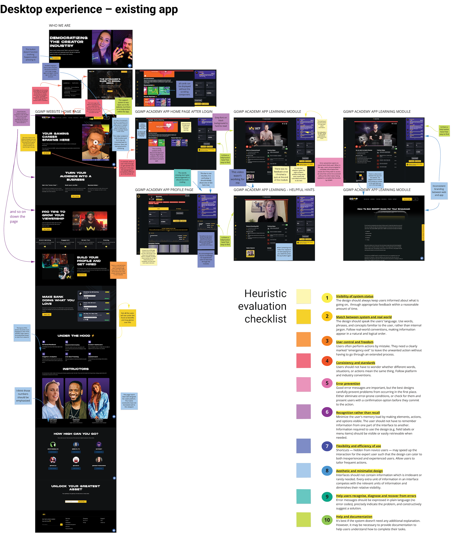
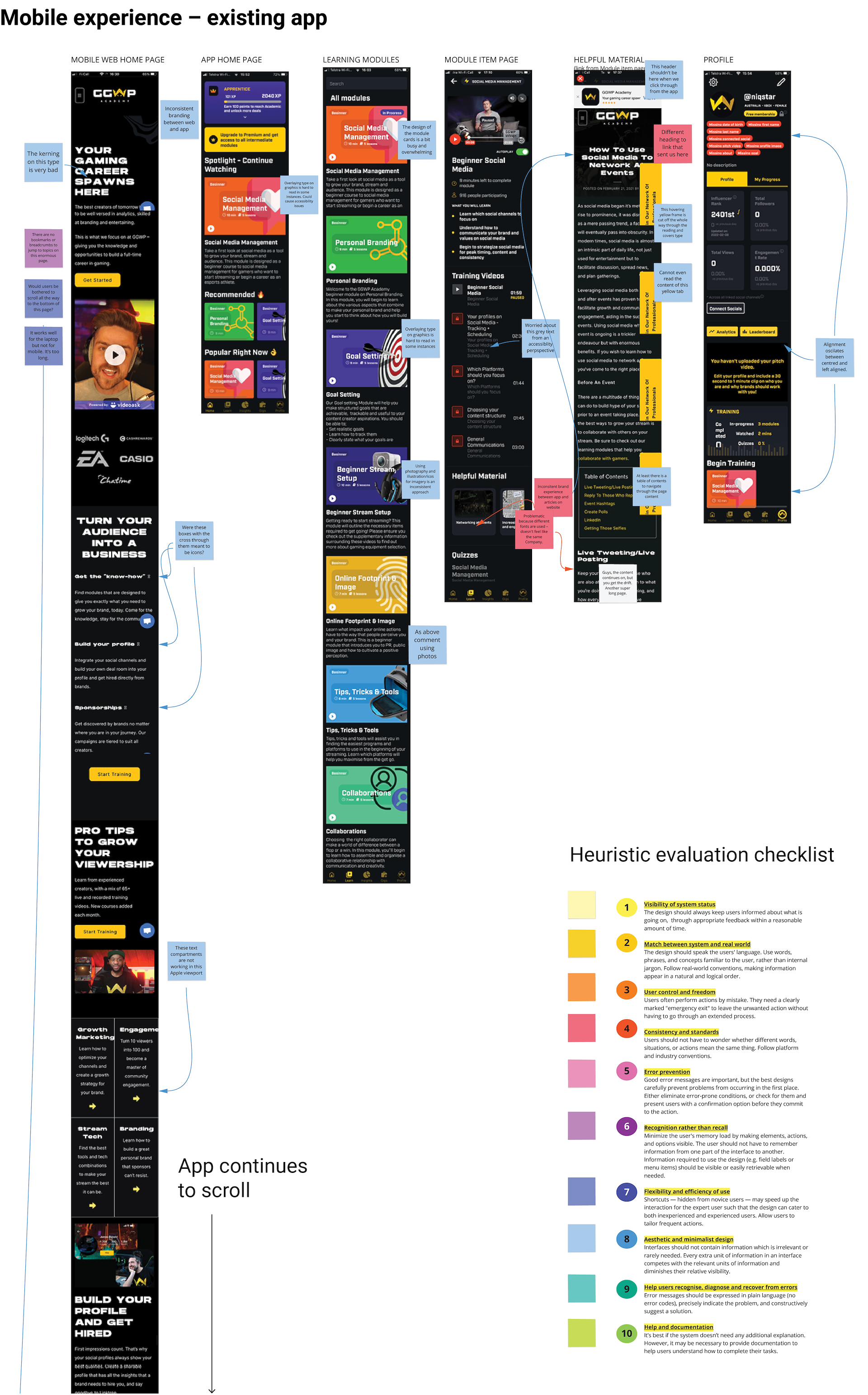
Heuristic evaluation
Our heuristic evaluation was comprised of four reviews over six pages. Pages in both desktop and mobile experiences reviewed were:
• GGWP website home page
• GGWP app home page
• GGWP app profile page
• GGWP app learning module in various states.
Although slightly out of scope, we reviewed both the main GGWP web page and the app. The reason being is that the GGWP main website is where all users will come and will be the first impression of their GGWP experience. It was important to take this step into account in our evaluation.
Key insights
Inconsistency
Inconsistent brand experience from the GGWP website to the app with different typography, brand styling and tone of voice in each instance – it doesn’t feel like the same company.
System
Buttons that don’t work when pressed or behave unexpectedly and video content glitching or not loading correctly depending on the device it’s being viewed on, are among some of the bugs we encountered that compromise the user experience.
Design
Design issues detracting from the experience included overly long page lengths in the main web page which relies on the user to keep scrolling, no visible GGWP brand presence in the app, poor use of space in the desktop experience of the app (most notably on the home page) and accessibility concerns.
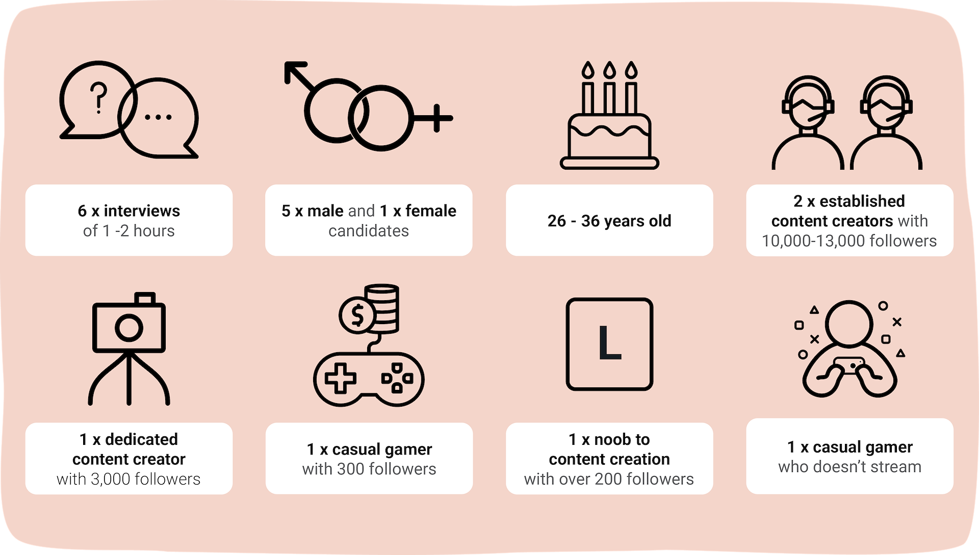
Who did we talk to?
We conducted research interviews with gamers of varying degrees of experience across national and international time zones.
Synth the research
We created an Affinity Map to sort the large amounts of data that we extracted from our interviews. There were a number of key themes and patterns that emerged – we clustered the findings into two categories – general background info to give us a clearer picture of our user, and specific findings to GGWP which helped paint a picture of the user needs on the platform . We then used all of those findings to create an Empathy Map.
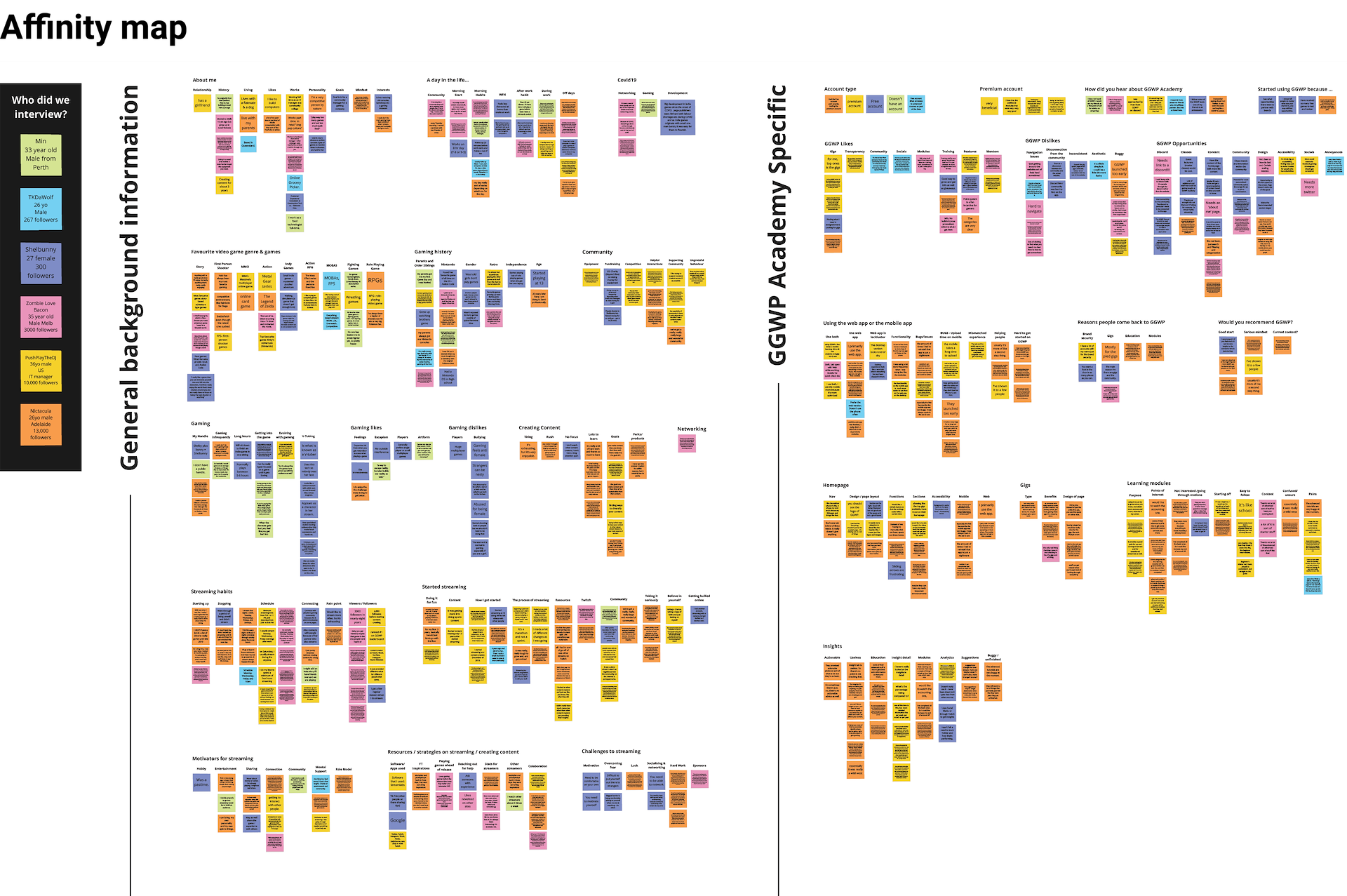
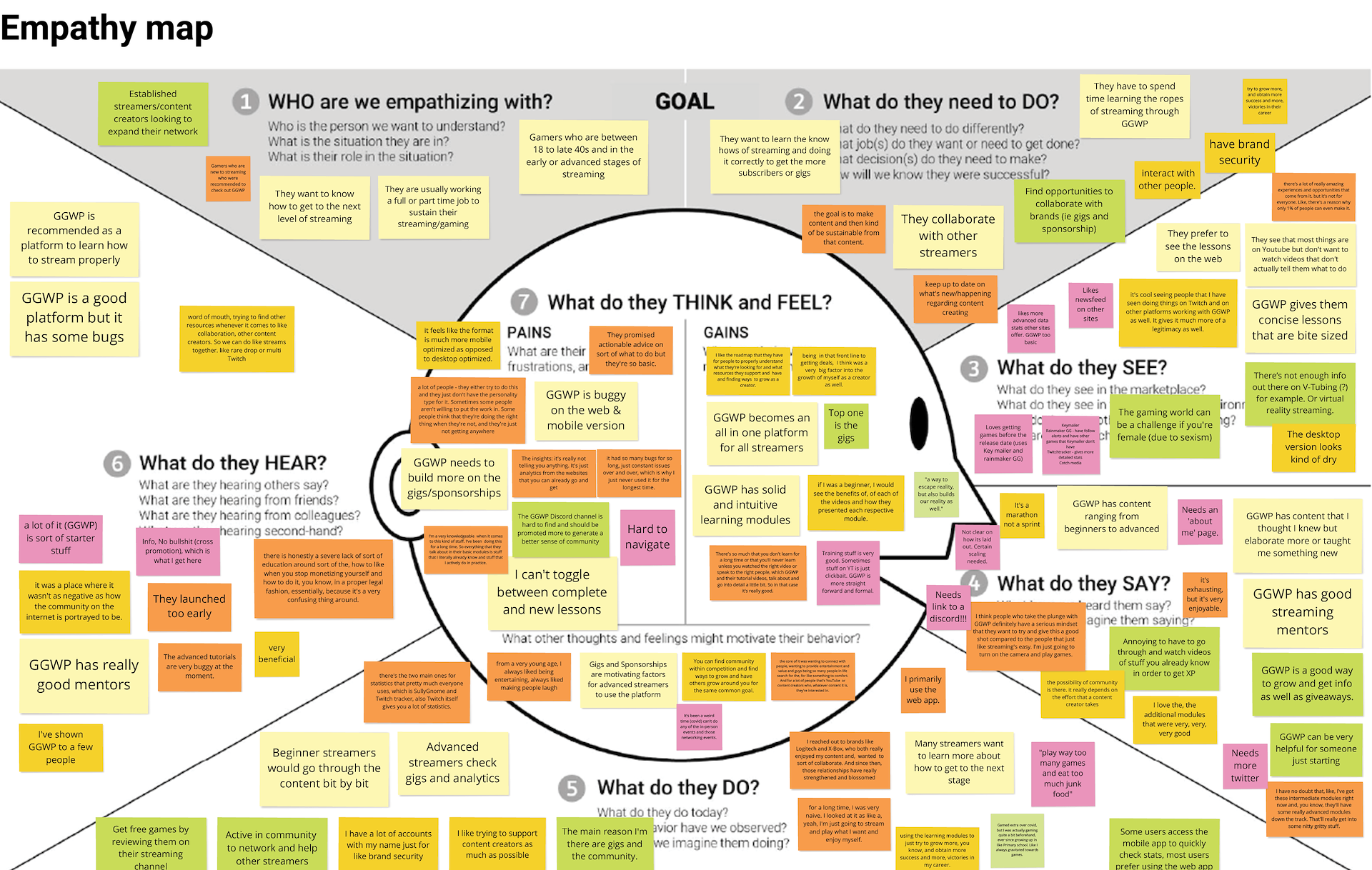
Key insights
Starting streaming is essentially not about making money or building a career, it’s about entertainment and connection to other people. The community is an integral part of gaming /streaming/content creation and GGWP can take a more active part to help users in that aspect.
Content creators have a lot of good resources for their stats. GGWP insights could be valuable to users by supplying extra value that they can’t get in those other websites. Currently users don’t feel they get that from the insights.
There is a preference among the users for the desktop app with quick check-ins on the mobile app. Mostly because it’s easier to watch the modules on the desktop app and the mobile app is slower to load.
Experienced content creators that started when GGWP wasn’t around had to work really hard to learn and build themselves. Many feel irritated that their prior experience isn’t taken into account and there isn’t a way for them to fast track their way to applying to gigs. GGWP can tailor the experience to the level of experience.
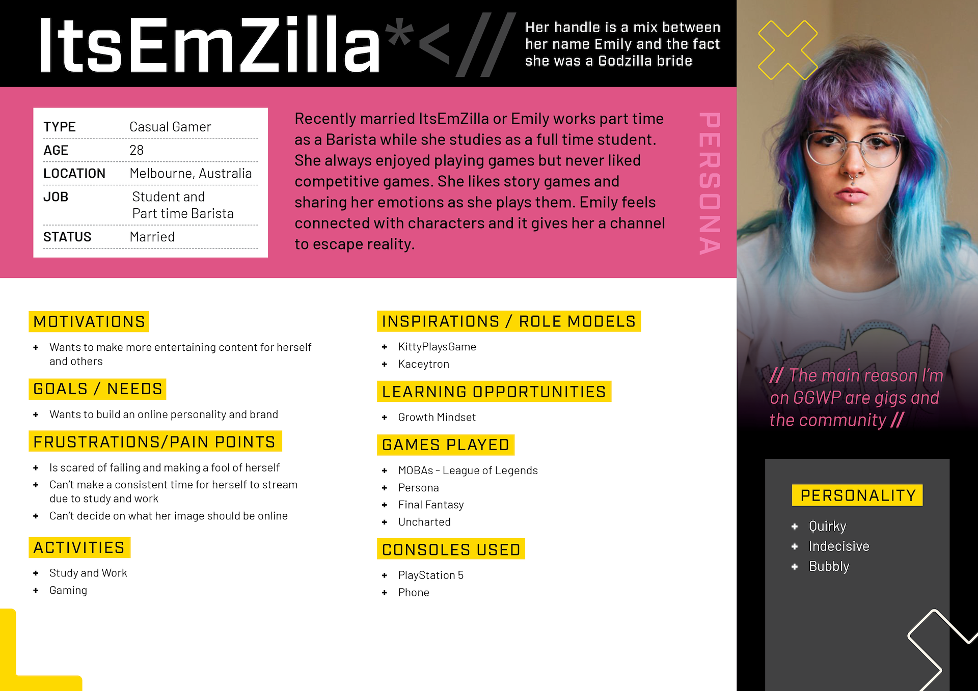
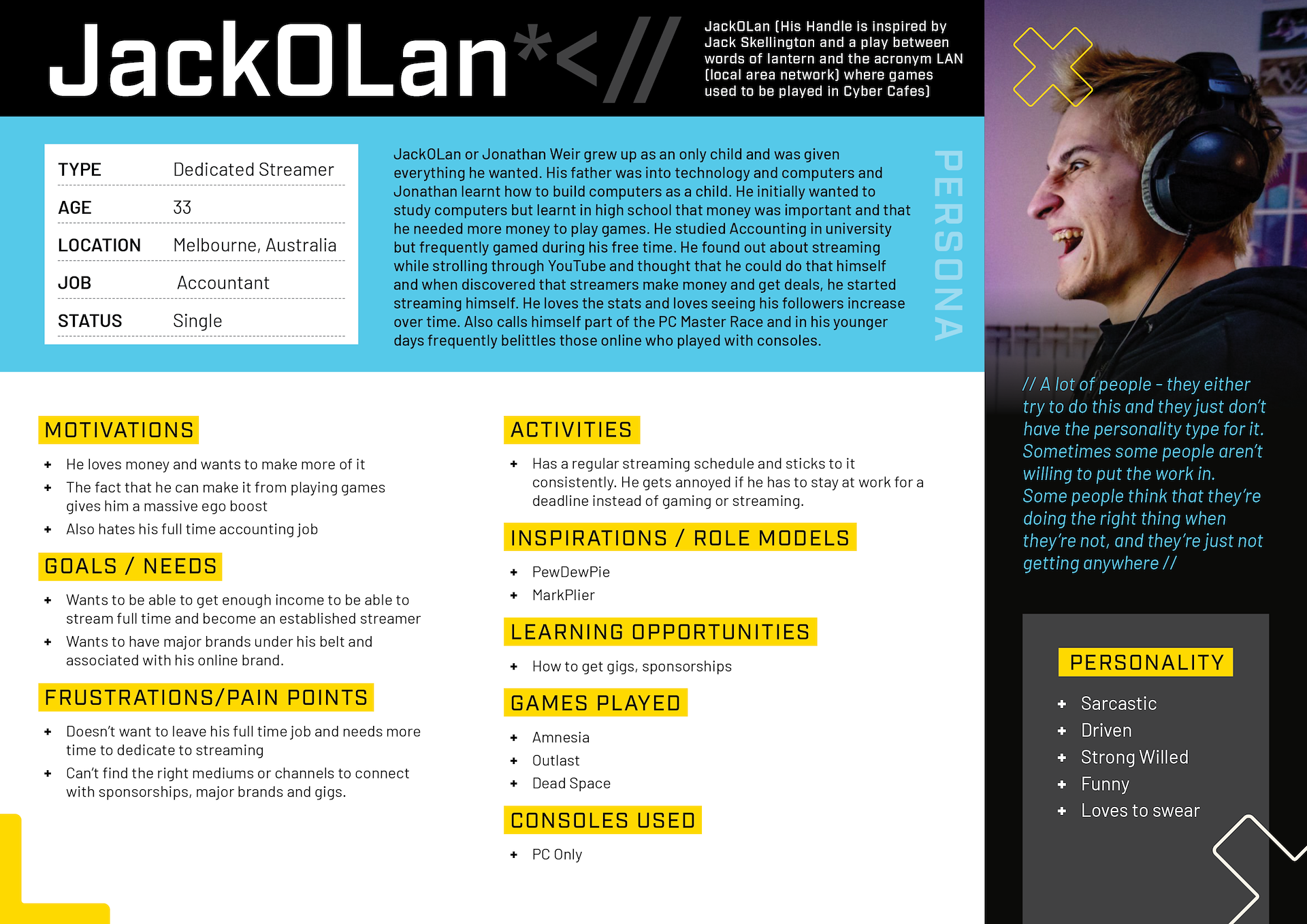
Who is the user?
Using all of the research compiled to date, we then went on to create three personas as there were three distinct user profiles we uncovered in the research. They were the 'noob' content creator/streamer who has no content creation skills and is unsure of where to start, the user who is slightly more established but needs help to build their personal brand and an online presence and finally, the established gamer and content creator who wants to grow their subscriber base, earn more money and generally become much higher profile.
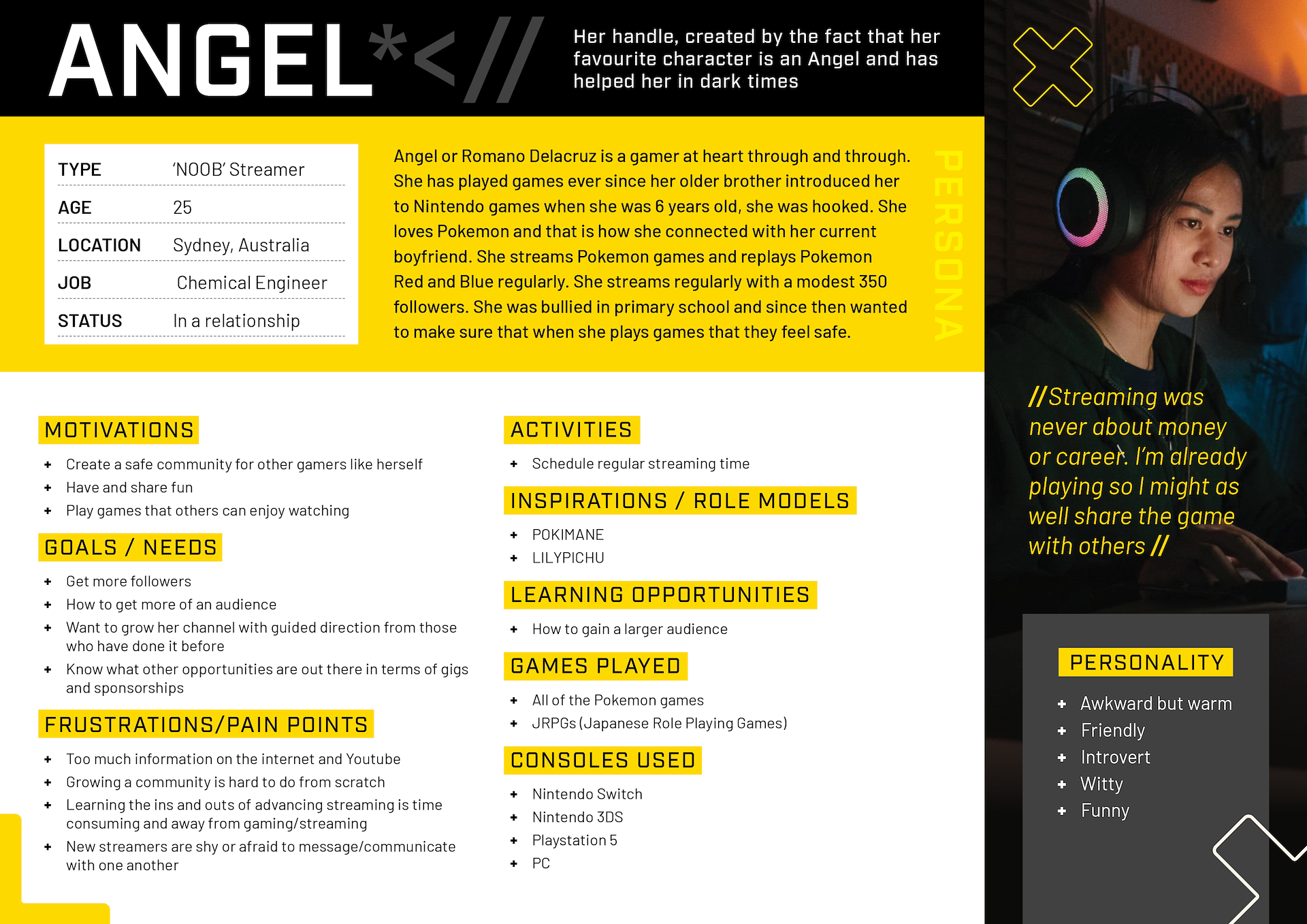
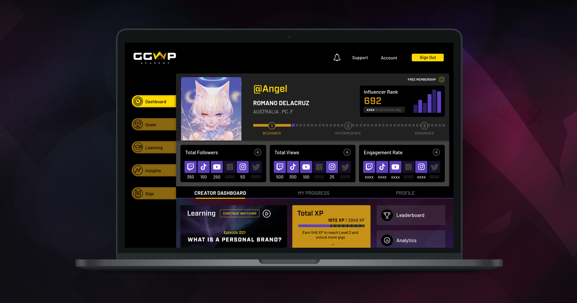
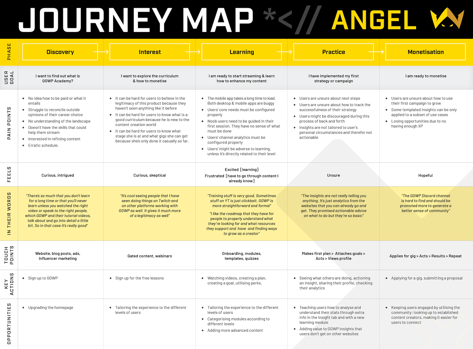
Angel's journey
In the end, we decided that we would follow Angel's (the noob) journey as this would be the user type that would be using / benefit from the full spectrum of the learning platform.
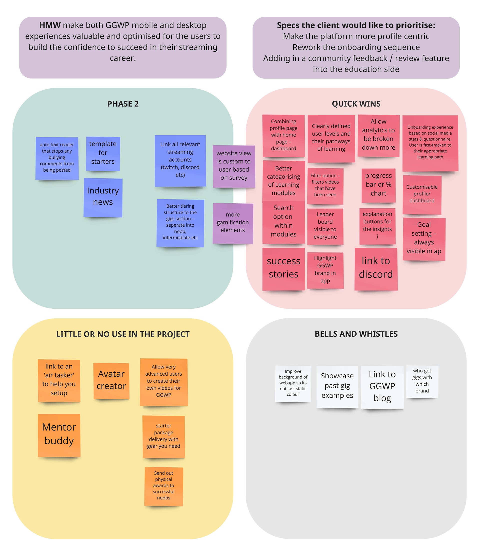
How might we?
“How might we make both GGWP mobile and desktop experiences valuable and optimised for the users to build the confidence to succeed in their streaming career?”
Ideation
Our ideation processes involved a detailed brain writing exercise and some Crazy 8's to explore some of these ideas a little further. At this point, the client came back with further additions to the brief including making the platform more profile centric, reworking the onboarding sequence and adding in a community feedback/review feature.
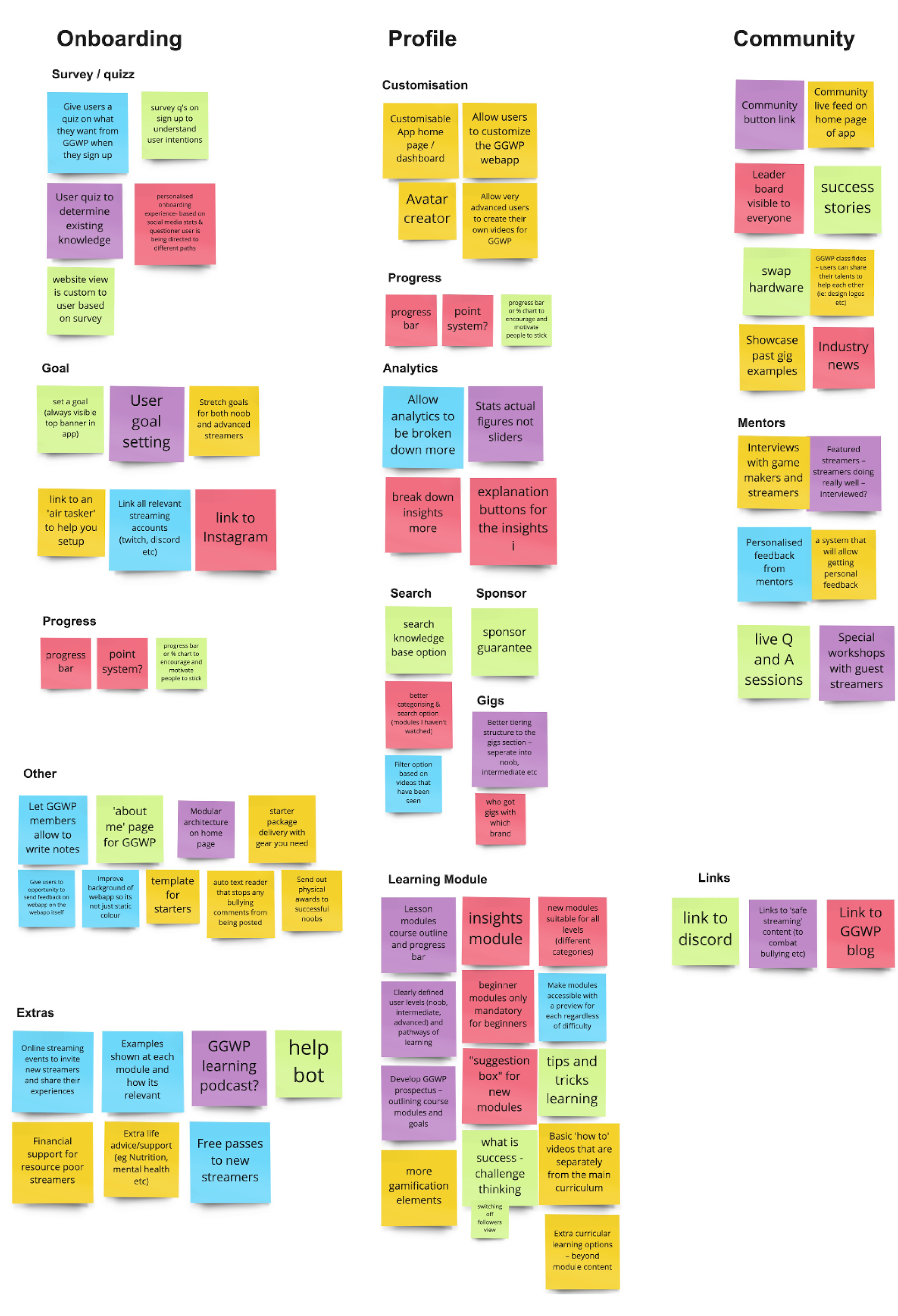
Brainwriting exercise
The team’s Crazy 8's
MVP
We identified a lot of quick wins in our MVP which was going to be fantastic heading into further development of the product.
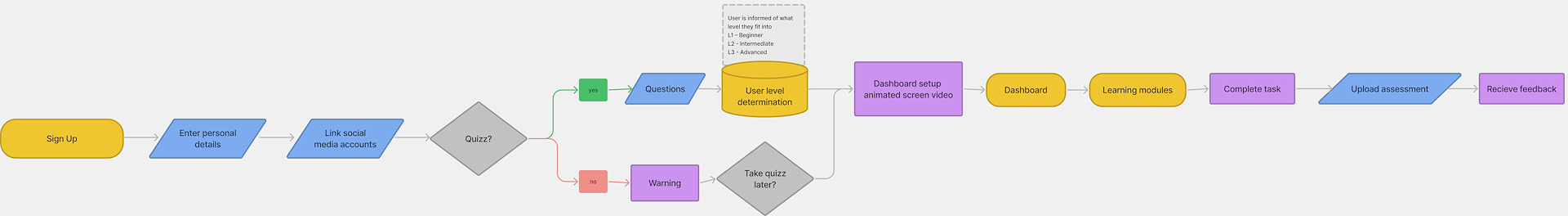
User flow
We created a user flow for an aspiring content creator, from creating an account to seeing content tailored to their learning needs on their dashboard.
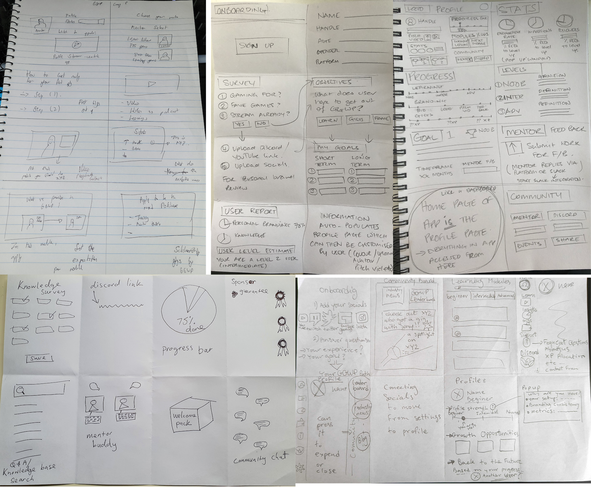
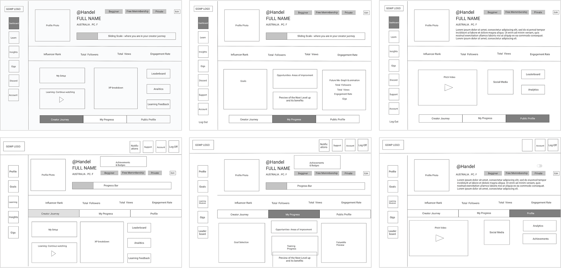
Sketches and lo-fi wires
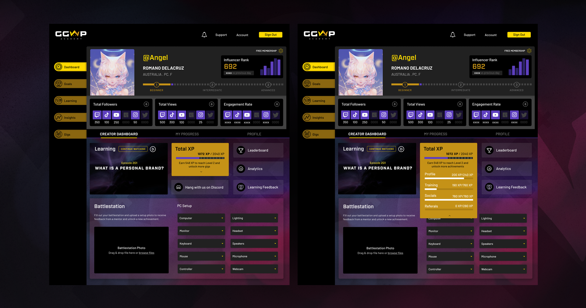
We really focused on the idea of a dashboard to make everything available to the user at once. Being a learning program we needed to make sure the latest video module would be on the dashboard and where they were at on their learning journey, as well as important stats and analytics of their streamed content. The results of those things have an impact on a user’s XP – which determines what gigs they are eligible to apply for.
Staying connected in the gaming community was important to users too – so we needed to find a way to facilitate that, without the need for excessive moderation from GGWP.
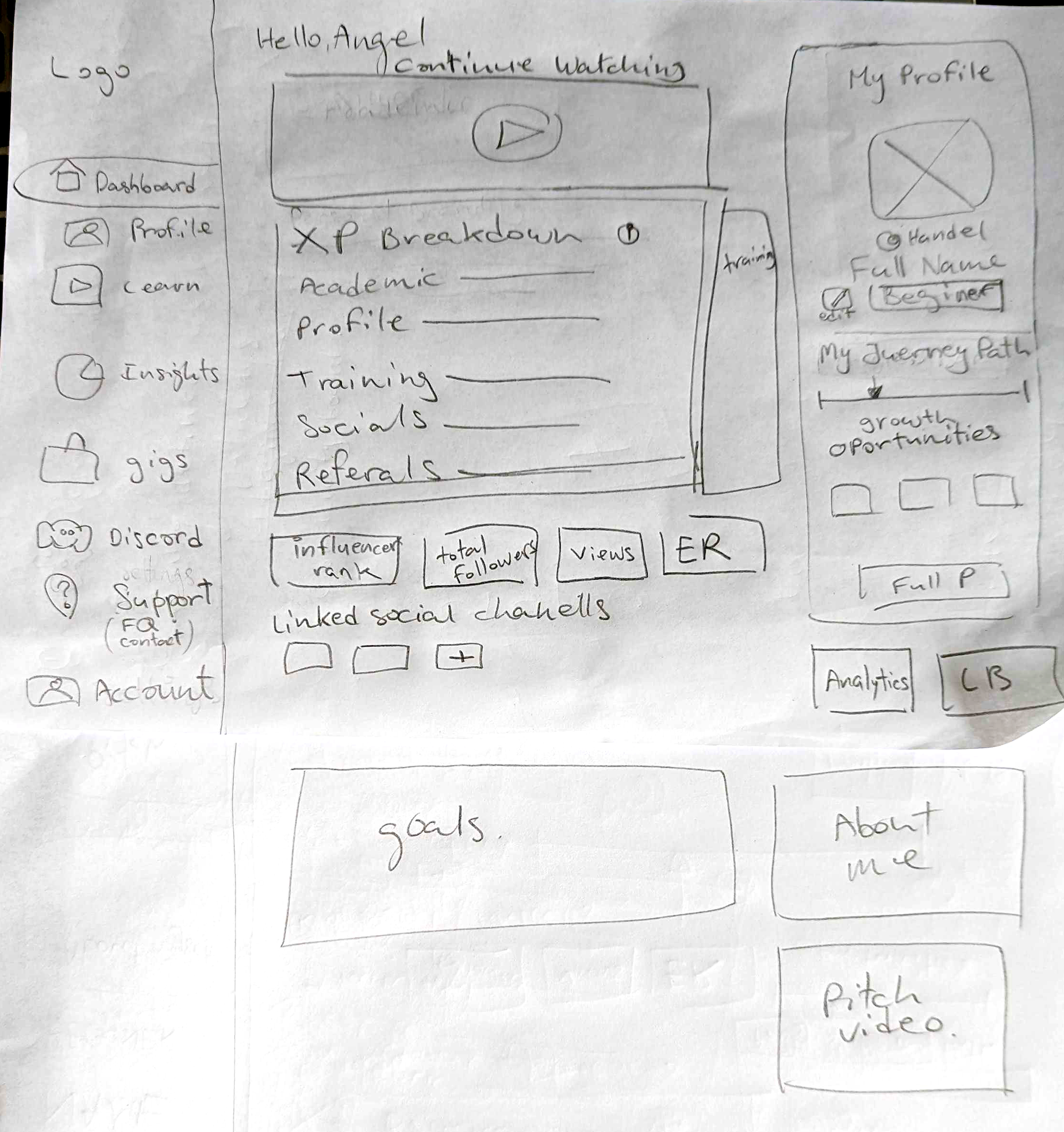
Initial sketches
Lo-fi wires
Gamifying onboarding
We knew we needed to include some kind of quizz during the onboarding process so that the user’s information could be used to populate their personalised dashboard when the onboarding process was complete. In order to maintain engagement during the process, we came up with the idea of a trading card (Pokemon style for nostalgia) building as each question was answered. At the end of the process, an animation will appear like confetti.
Below is a before and after slider of the first frame and the last frame of questions for the onboarding process – illustrating how the card populates. The XP points accumulated indicate the level of experience the new user has which would be taken into account when collating the suggested learning content for the user dashboard.
User testing
We did user testing on our first version of the clickable prototype and got some really great feedback. We got some encouraging feedback and iterated on some of the great insights we received.
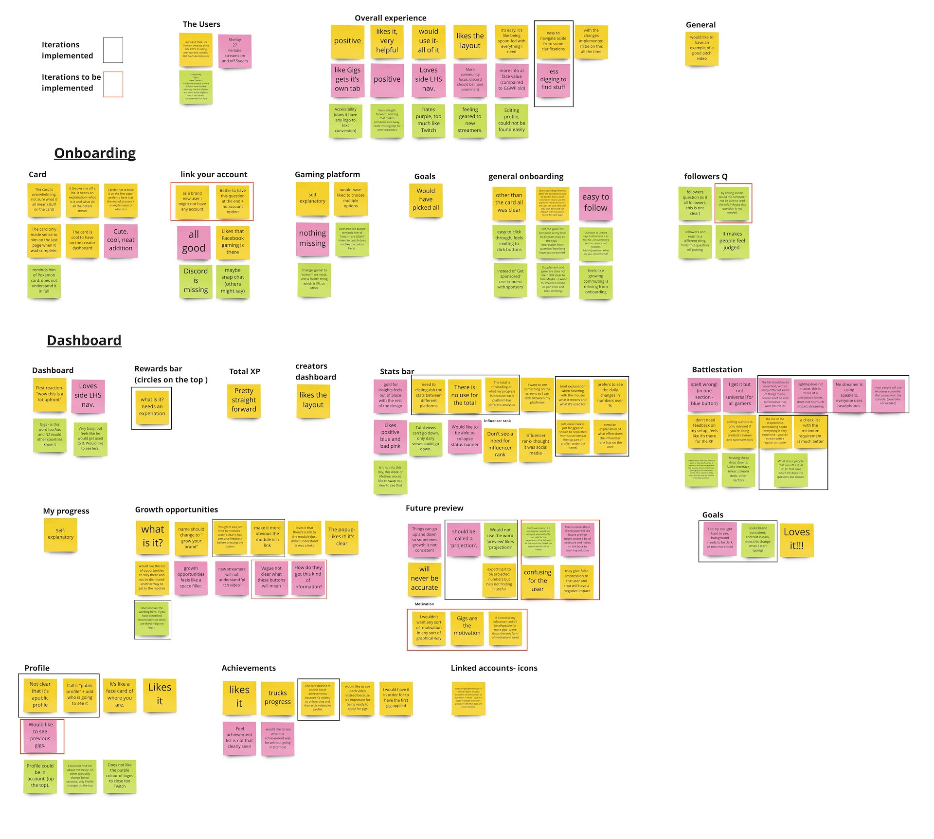
Killer quotes
“Feels straight forward and inviting – especially for new streamers”
“It's easy! it's like being spoon-fed with everything I need”
“With some of these changes implemented, I'll be on this all the time"
Iterations
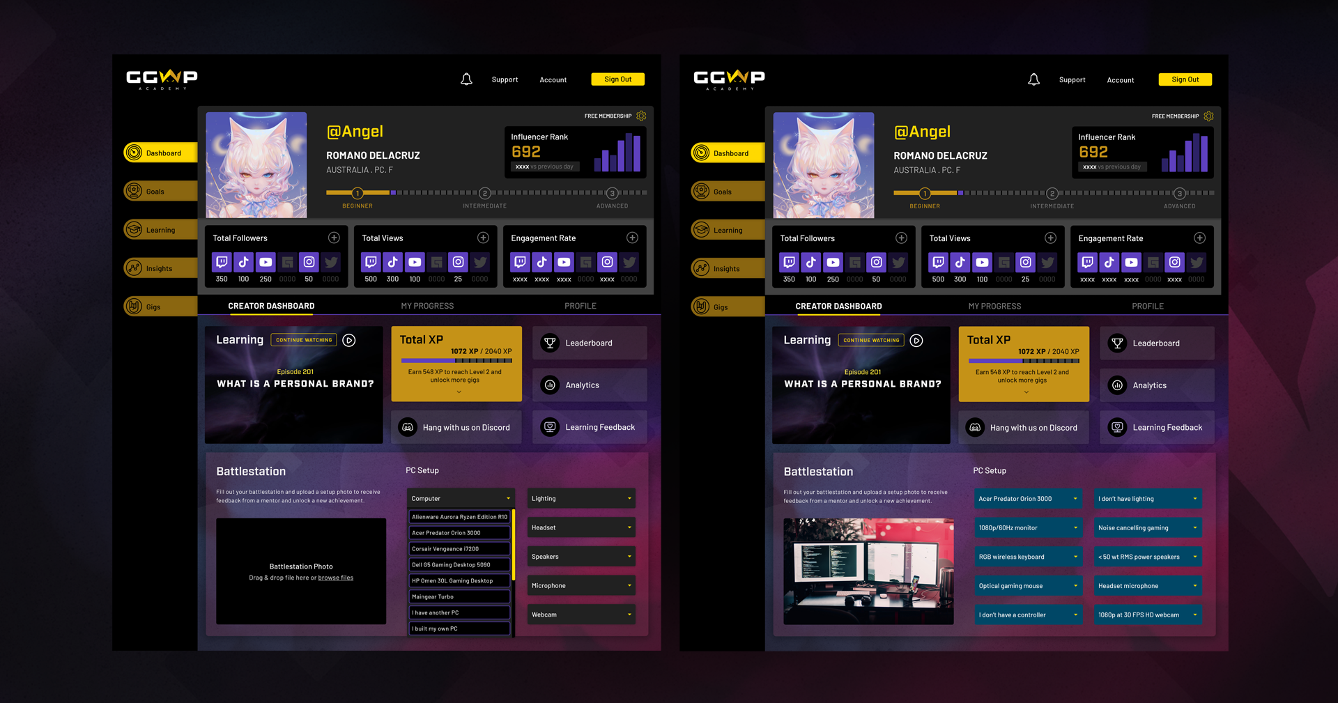
Based on the insights received from our user testing, we completely reworked the way the analytics section in the top of the dashboard worked to add more value to the users by breaking down results per social channel. We also changed aspects of the UI to make it feel more open and less busy. We also modified the learning progress bar as well.
The before and after slider below illustrates the changes we made on the dashboard. We also made changes to the presentation of the onboarding process, which we have included in the image slider underneath the dashboard slider.
Hi-fi prototype
Drive it like you stole it! I’ve embedded the high fidelity clickable prototype below.
Please note: we only built out the onboarding flow and elements of the Dashboard.
Conclusions
User testing uncovered that not all users felt positively about the ‘Future Projections’ section. This was meant to be a motivator for users however the overall feeling was that it may give a false impression to the user and that will have a negative impact. Both research and user testing uncovered that Gigs and Sponsorship are huge motivators for gamers so that is a direction we would explore in the future.
It was suggested that the ‘followers’ question in the onboarding flow be removed as this data would be able to be captured by linking socials. Some users also felt judged to be asked how many followers they had.
Test revealed that a noob creator will benefit more from a check list of the minimum requirement for their setup on the Battlestation. The dropdown version felt intimidating to some users so that is something we would change in the next iteration.
Based on user’s feedback we also suggested adding some tool tips (popup information boxes) to clarity some elements on the platform.