ROLE
Art Director / Senior Designer
FOR
Waminda
South Coast Women's Health and Welfare Aboriginal Corporation
DATE
January 2020
TYPE
Full brand refresh and evolution
Waminda are an organisation doing incredible work helping empower Aboriginal women and their families with culturally safe healthcare programs and community initiatives.
Waminda’s old brand was disunited and confusing – probably due to the number of different programs it has launched over the years. We were briefed to create a unified brand and element suite and develop Waminda’s style guide based on findings in the audit of current marketing and communication content and visual design.
Our focus was to keep to the essence of the deeply valued and recognised brand, whilst allowing it to evolve. It’s continued connection to the community was at the heart of the refresh.
There were some existing elements that were part of the brand that we didn’t want to lose, however they needed to evolve in order to make them easily applicable across a broad range of channels.
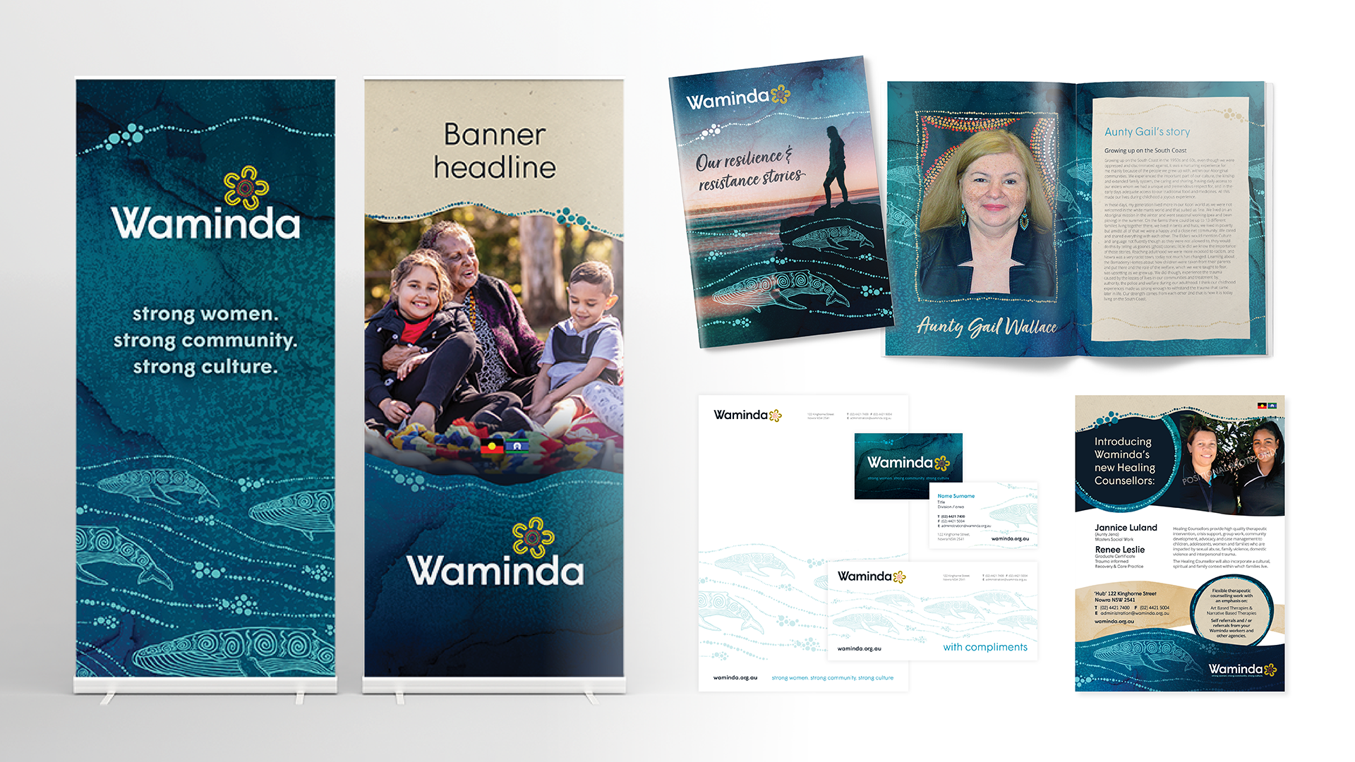
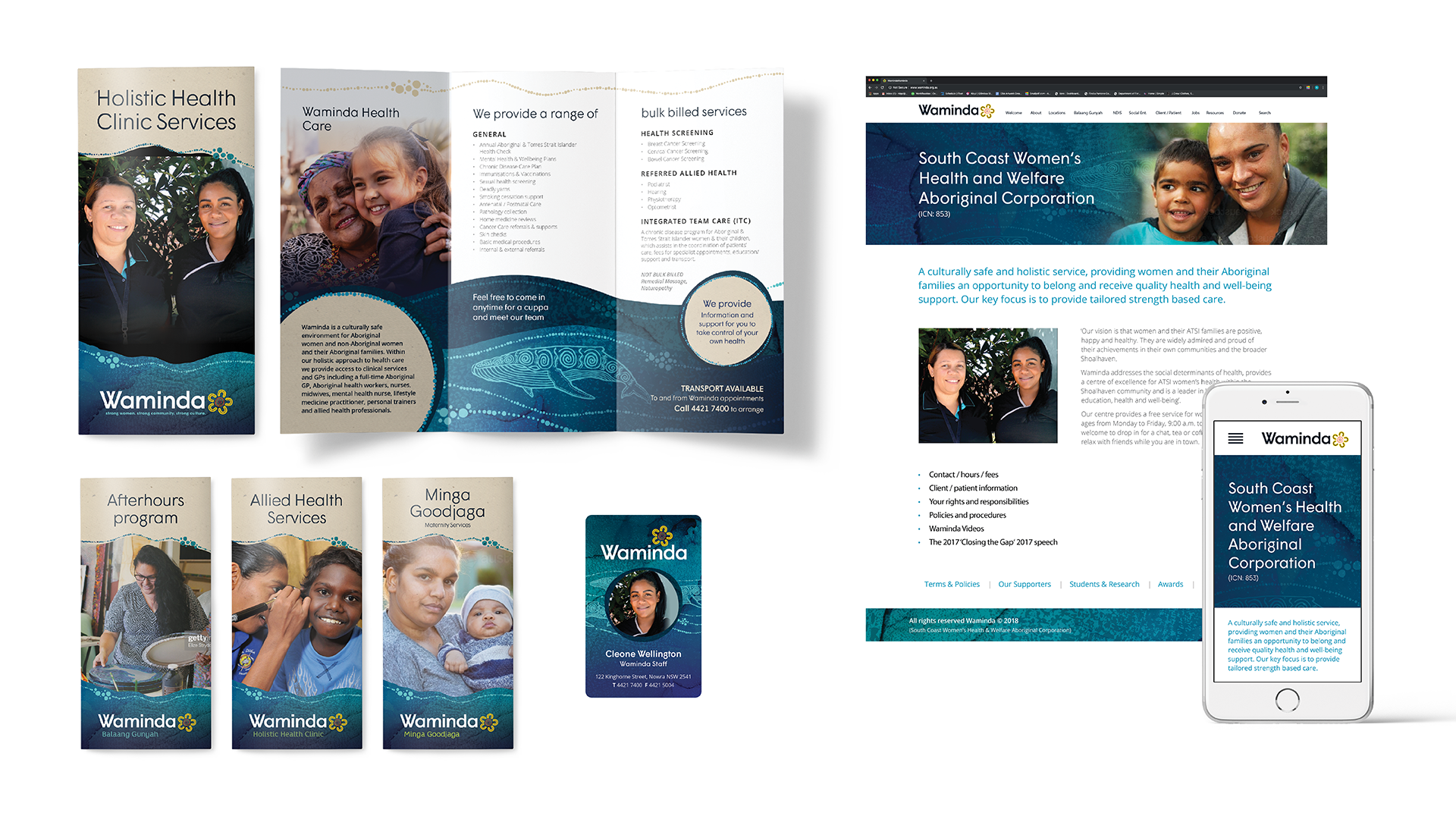
I created a brand system for Waminda, that maintains the values of the previous brand but in a simplified and far easier to apply way.
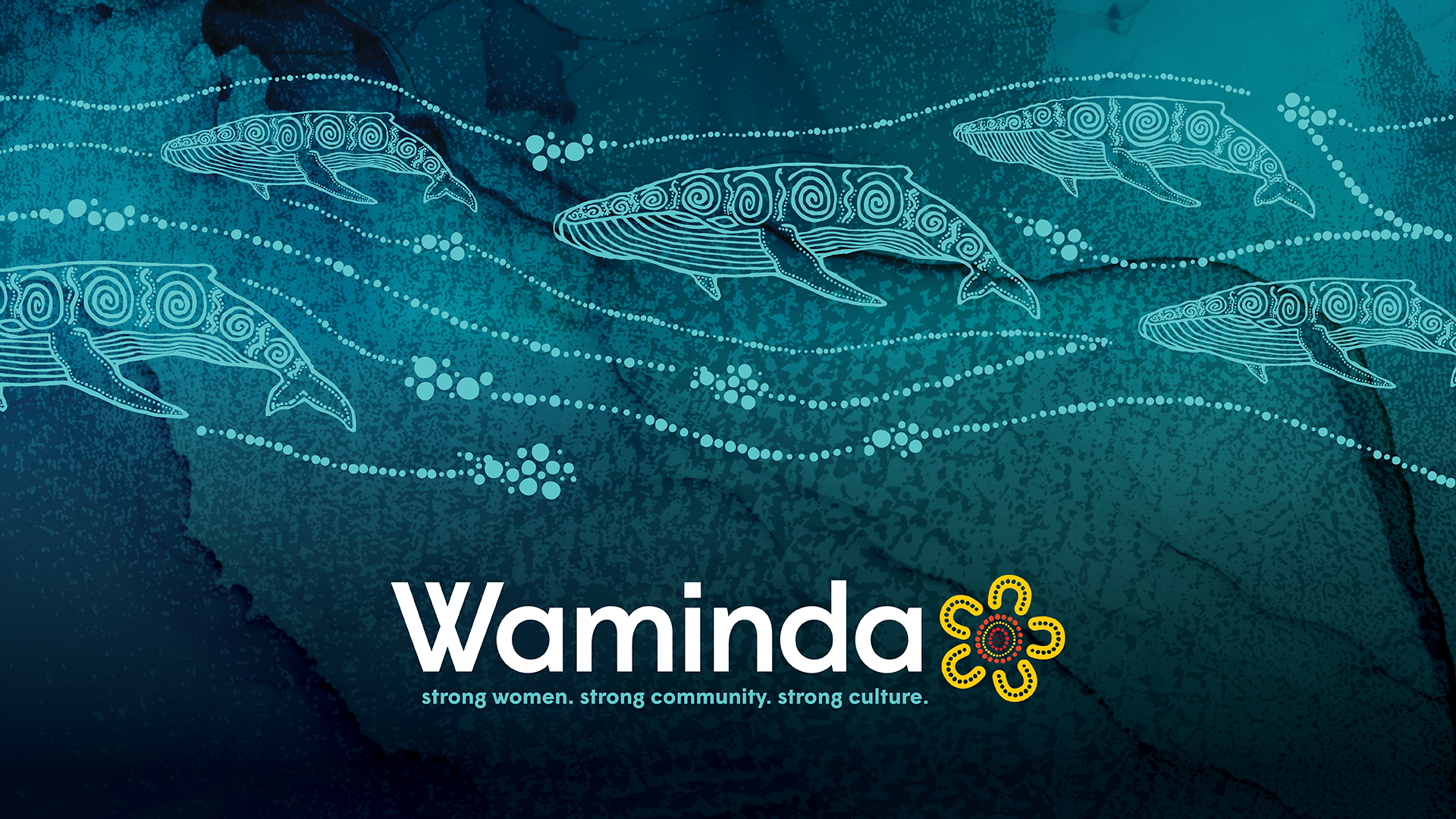
Above is a before and after slider – the lefthand side is the old logo and the right hand side is the new logo. In both logomarks, we see strong women being represented by the yarning circle element of the brand. Strong women coming together, to support each other, in a safe place. The yarning circle is a significant component of the Waminda identity. However, I needed to consider its impact and ease of application.
The opportunity was to give the element greater strength by maintaining it’s integrity whilst simplifying to ensure it will reproduce consistently at any size. To create a more dynamic logo I looked at the components of colour and type and selected a bold, yet feminine font to accompany the refreshed yarning circle.
I also reviewed the colour treatment, allowing the yarning circle to feature more prominently. The Waminda Gold was maintained, however the Waminda Teal has been slightly modified and used as a primary colour throughout our design elements. I have introduced a navy background which integrates well with Waminda’s colour palette, and creates a softer alternative to black. The overall effect is harmonious and these elements are stronger together.
The tagline was included as part of the lockup to reinforce Waminda’s values.
With the greatest respect and care (and permission from the artist herself) I took elements from Michelle’s artwork and vectorised them in order for them to integrate more easily with the graphic design system of the branding. I took the vectorised whales in their complete form, and lifted some dot clusters to illustrate stylised waves, which were then used as a design element on all collateral.